Selected work · 2020–2024
Case studies.
Four projects across public-sector platforms, healthcare, design systems and mobile wellness. Each one walks through the problem, the approach and the result.
Scroll to explore ↓European Parliament
Turning 150+ fragmented websites into one accessible, search-first platform built around what people actually came to do.
2.1 AA100% on redesigned components · 24 languages
The Parliament's content lived across more than 150 separate sites built over years, each with its own navigation, its own search and its own version of overlapping content. No shared design system, so the same component behaved differently everywhere.
Basic tasks like finding an MEP, following a law or making contact meant hopping between unrelated sites. Internal teams were overloaded with misrouted requests, and with no accessible component library, WCAG compliance was handled case by case, if at all.
The org chart was driving the navigation, and users were paying for it.
I contributed as a UX Designer on the SEF project (codename Sullivan) within a cross-functional team, over roughly two years. As part of the conception team, my work concentrated on Top Tasks classification, information architecture, user journeys and accessibility, working alongside designers, integrators, the accessibility team and developers.
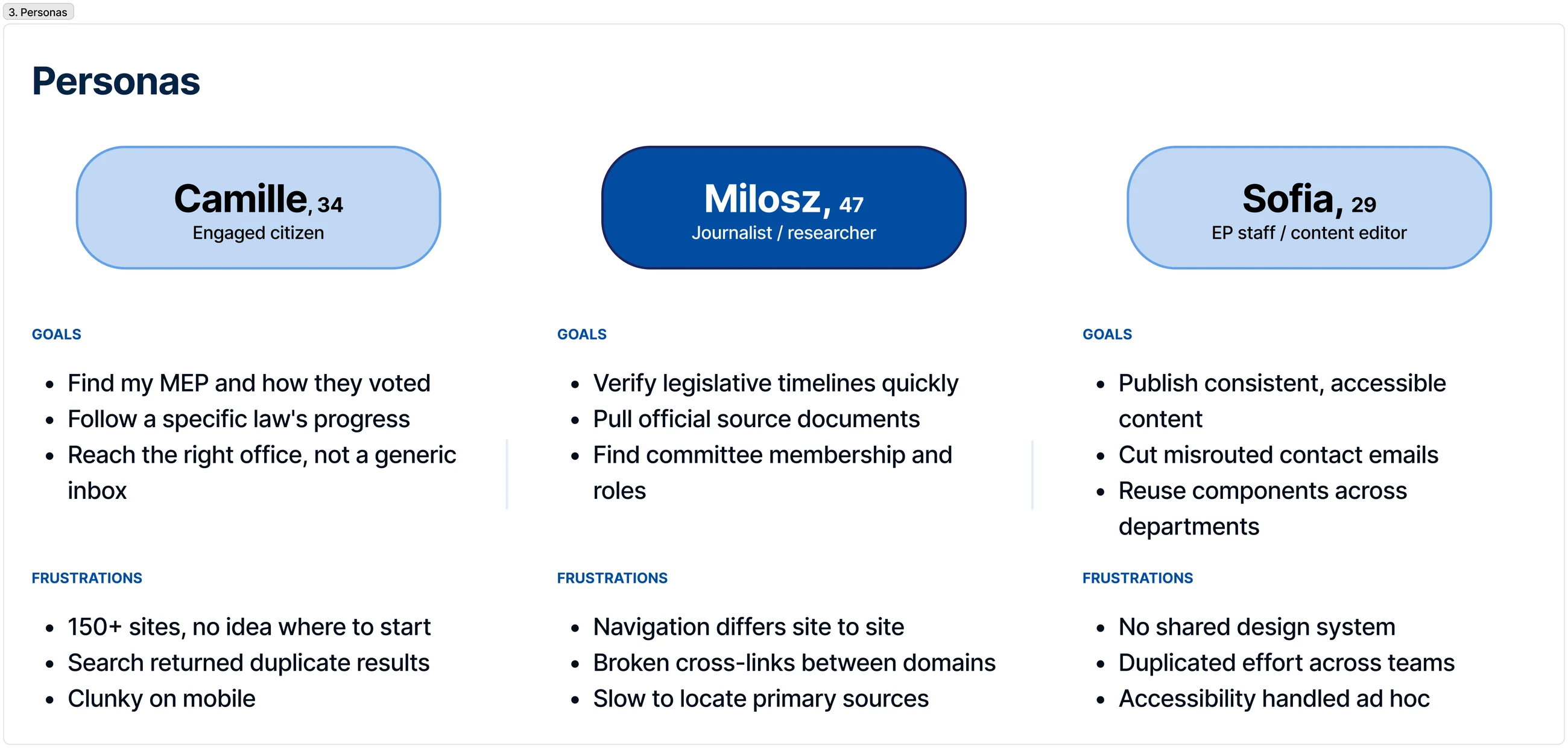
We structured the work around the Double Diamond, so the team understood the problem deeply before committing to a solution.
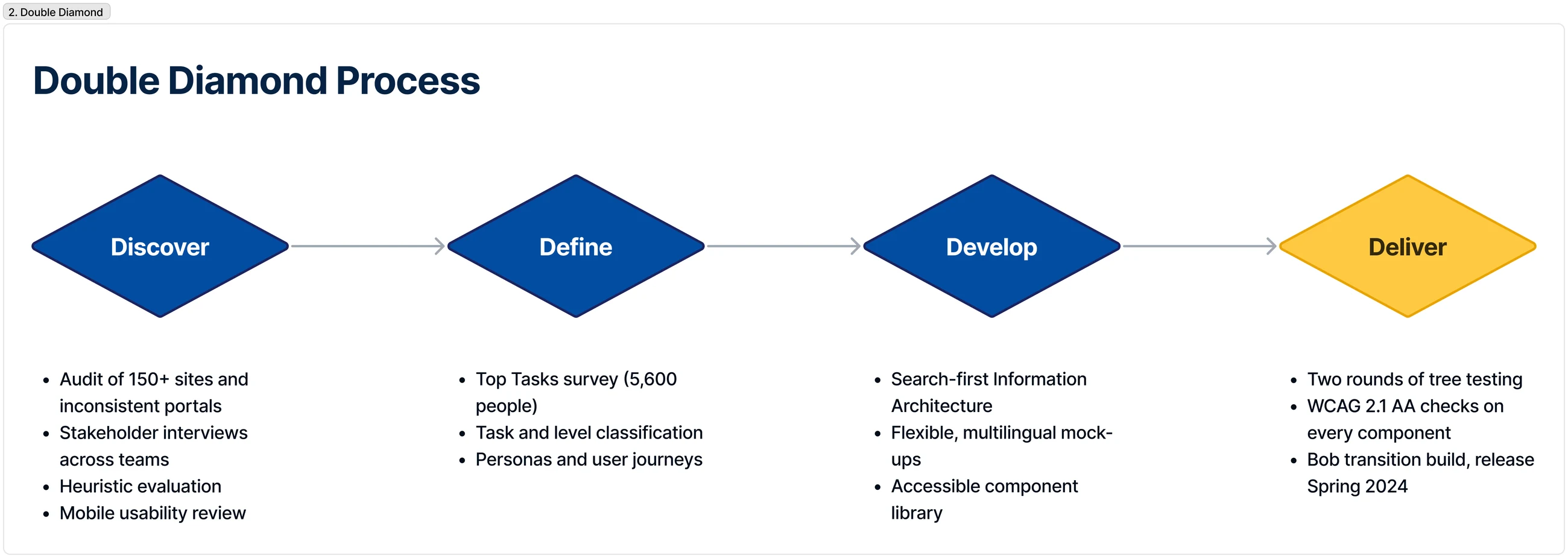
Before designing anything, we replaced assumptions with evidence. A survey of 5,600 people asked them to pick the five things that matter most about the Parliament. Their answers sorted 64 candidate tasks into a clear hierarchy: a vital few (the top 9) that carry most of the demand, and a long tail that had been given equal navigational weight.
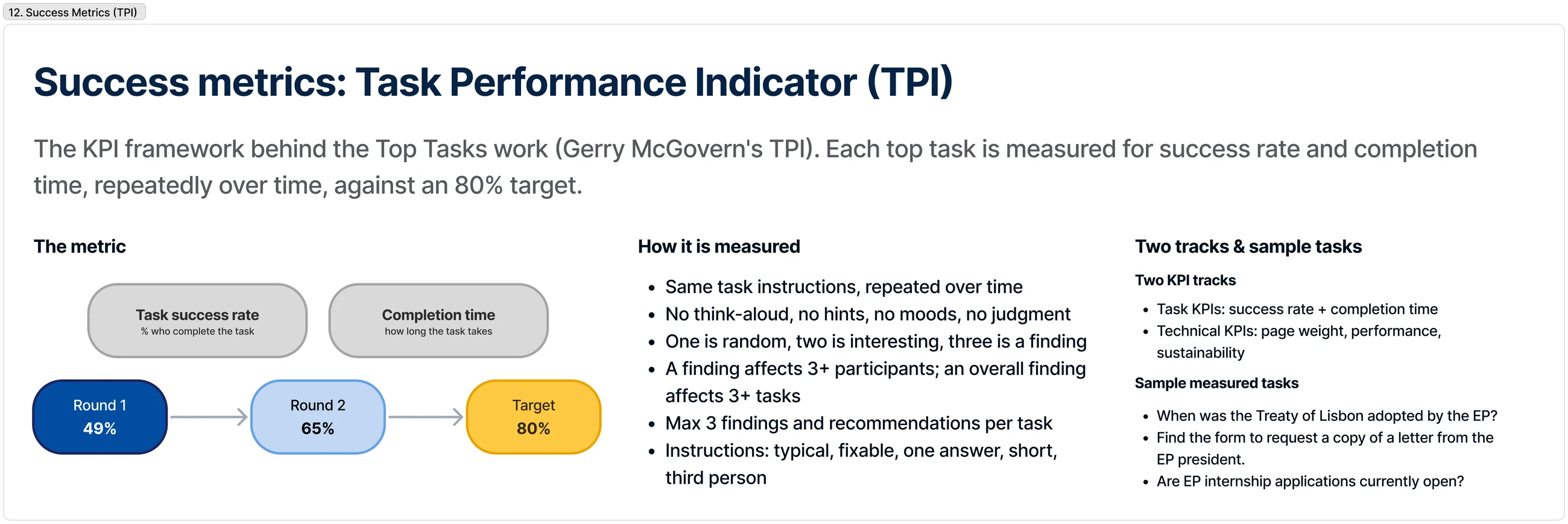
We then tree-tested two navigation structures. Measured task success rose from 49% to 65% across two rounds, against an 80% target. That set the principle for everything after: build around the vital few, and make search the front door.
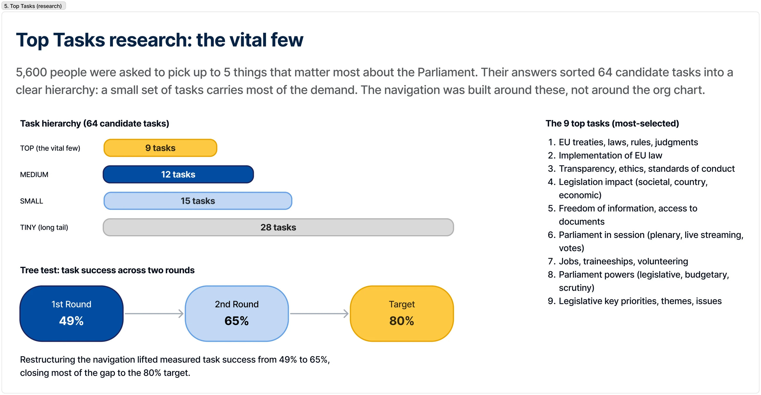
Alongside the task research, I ran a heuristic evaluation of the pre-redesign sites against Nielsen's ten usability heuristics. The most severe issue was consistency: with 150+ sites and no shared standards, the same component behaved differently everywhere.
Other majors: navigation that mirrored the org chart rather than user tasks, and unclear contact channels that caused misrouted enquiries. Each issue was paired with a concrete fix in the redesign.
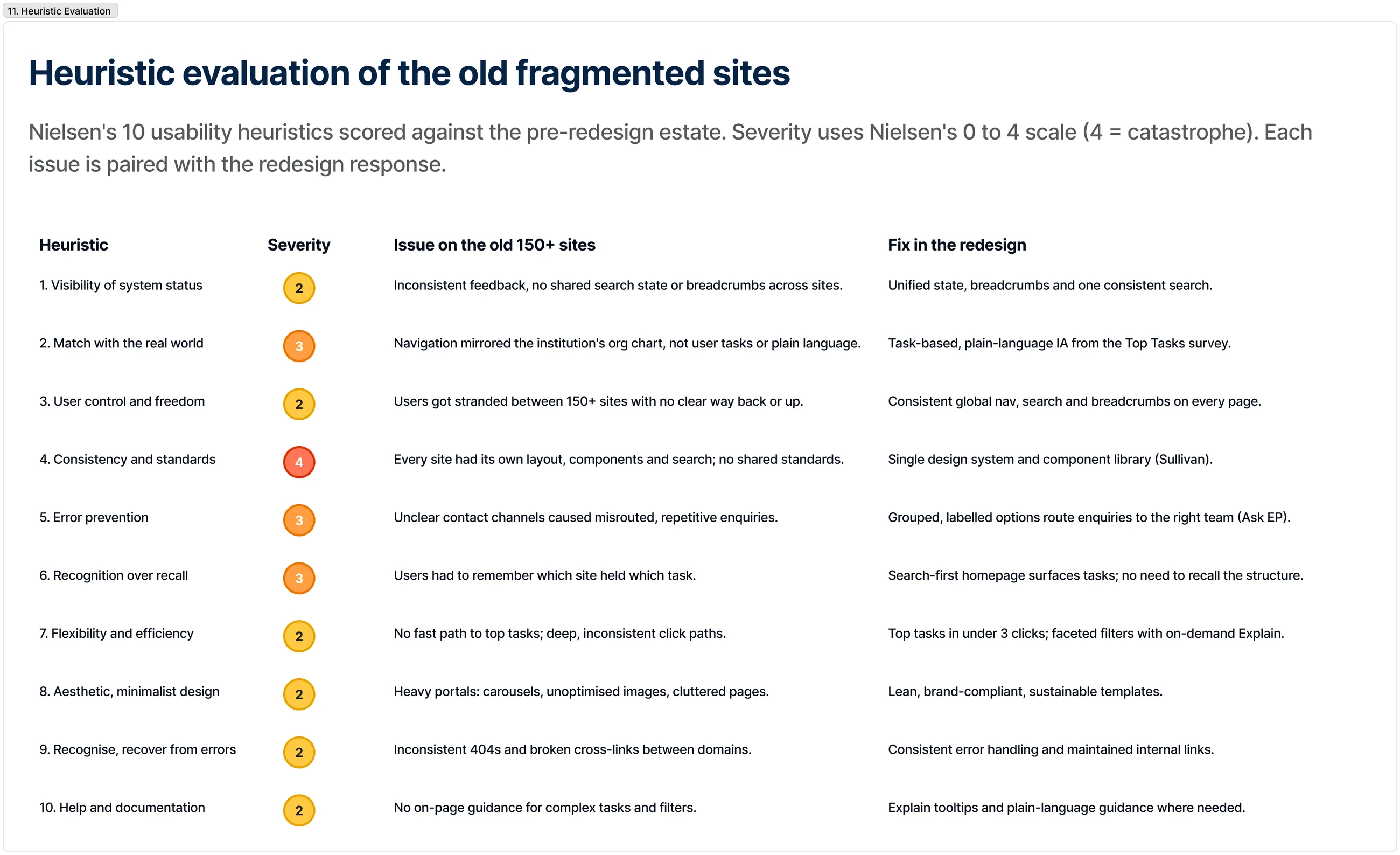
Research was distilled into personas that kept the team anchored to real needs rather than internal structure: Camille, the engaged citizen who just wants to reach the right office; Milosz, the journalist verifying timelines on deadline; and Sofia, the EP content editor who needs to publish accessible content and stop fielding misrouted enquiries.
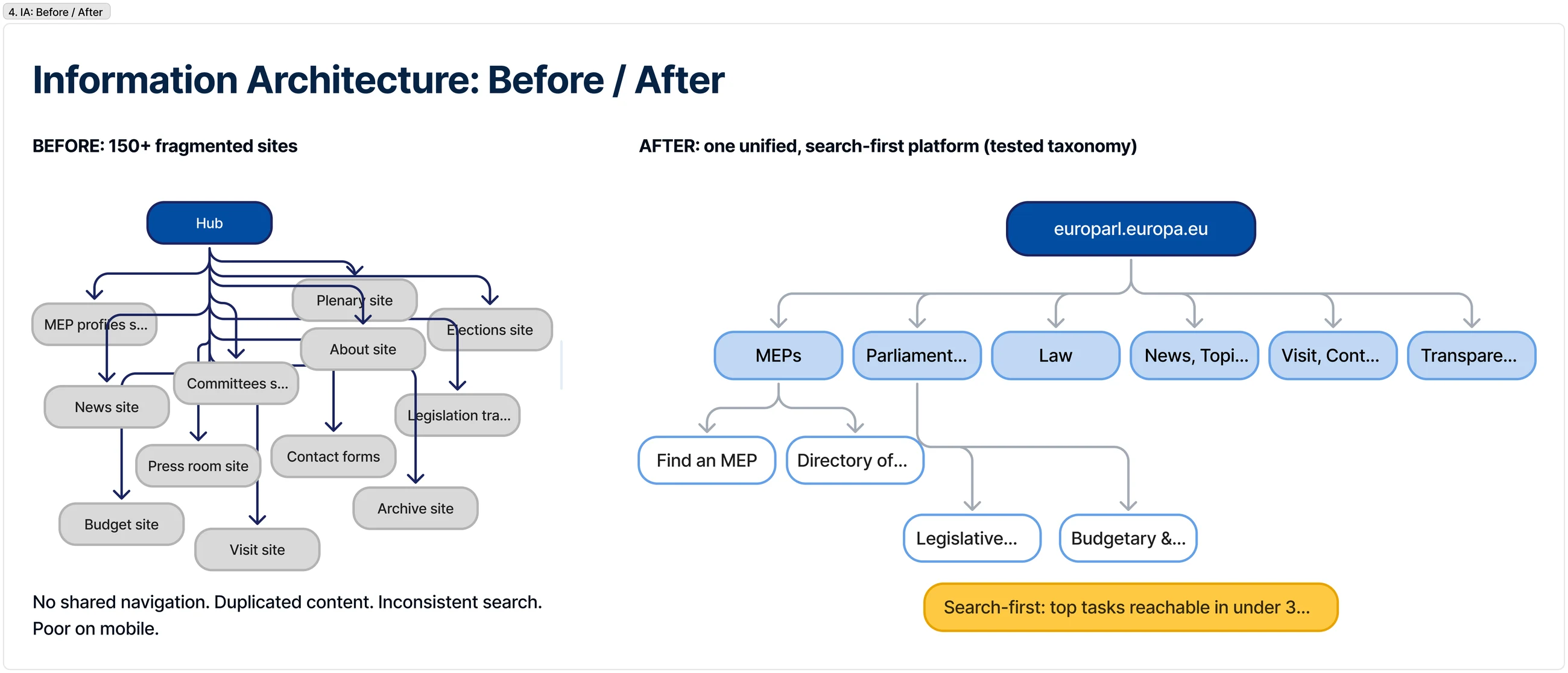
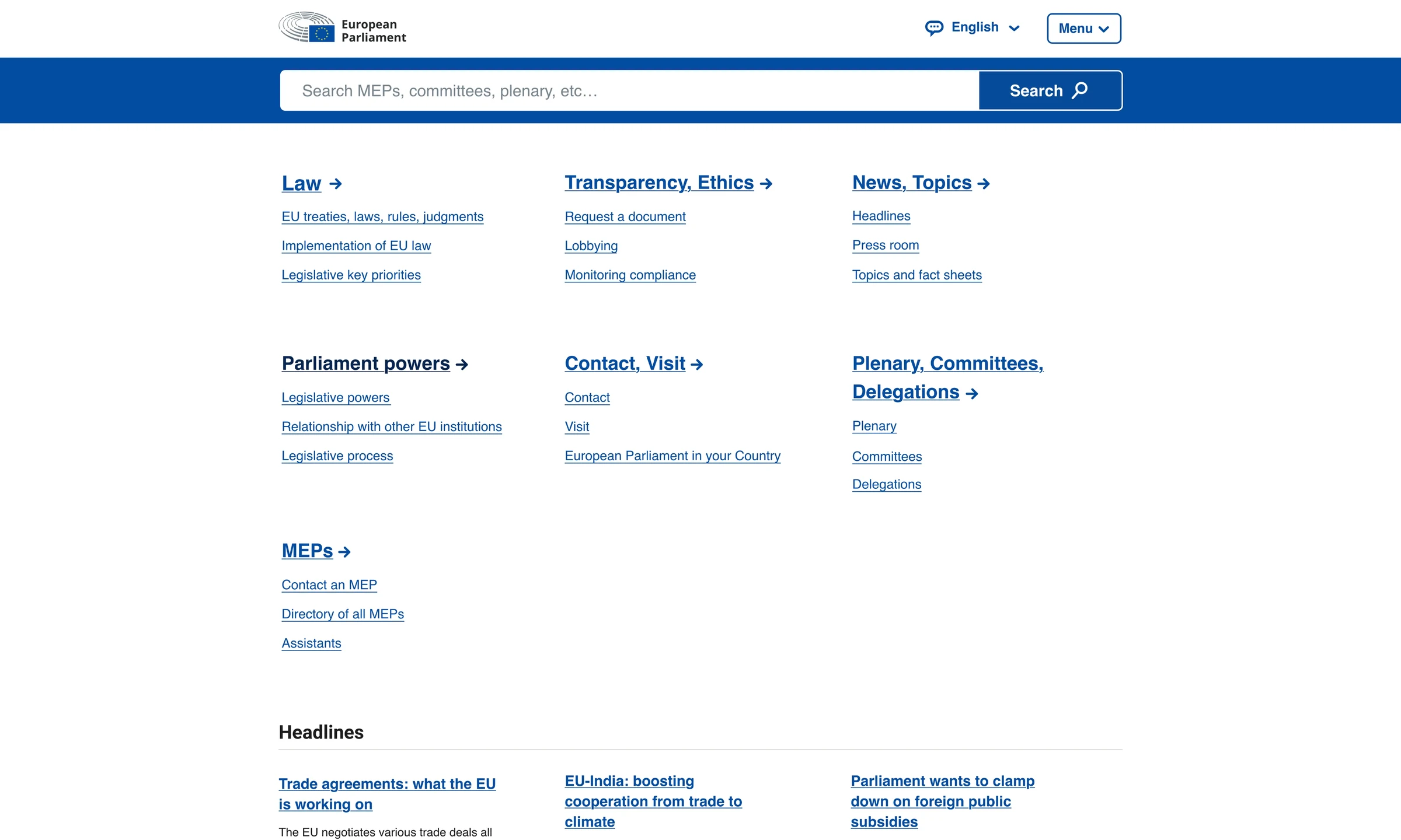
The core move was to collapse 150+ silos into one platform with a single, consistent taxonomy, and to make a prominent search the primary way in. The new homepage leads with one search across MEPs, committees, plenary, press and media, over a clear top-level structure.
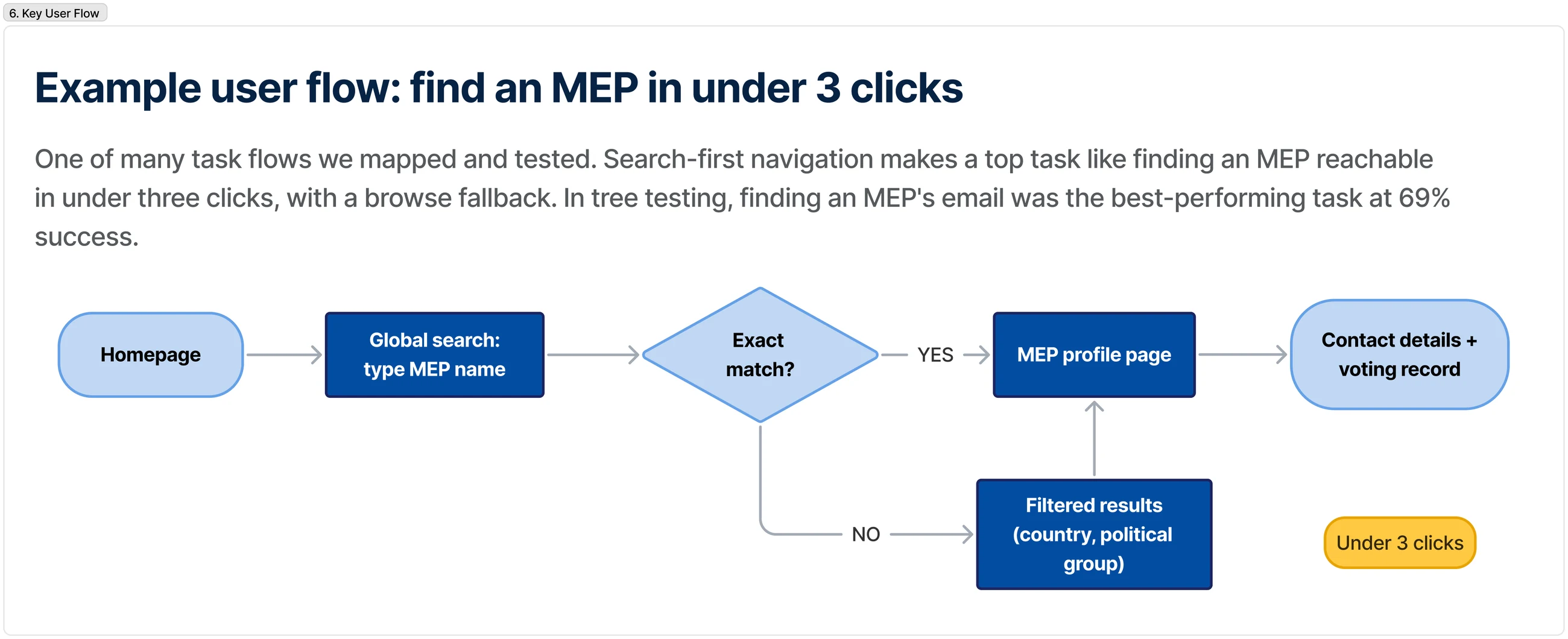
The test we held ourselves to: reach any top task in under three clicks, whether you search or browse.
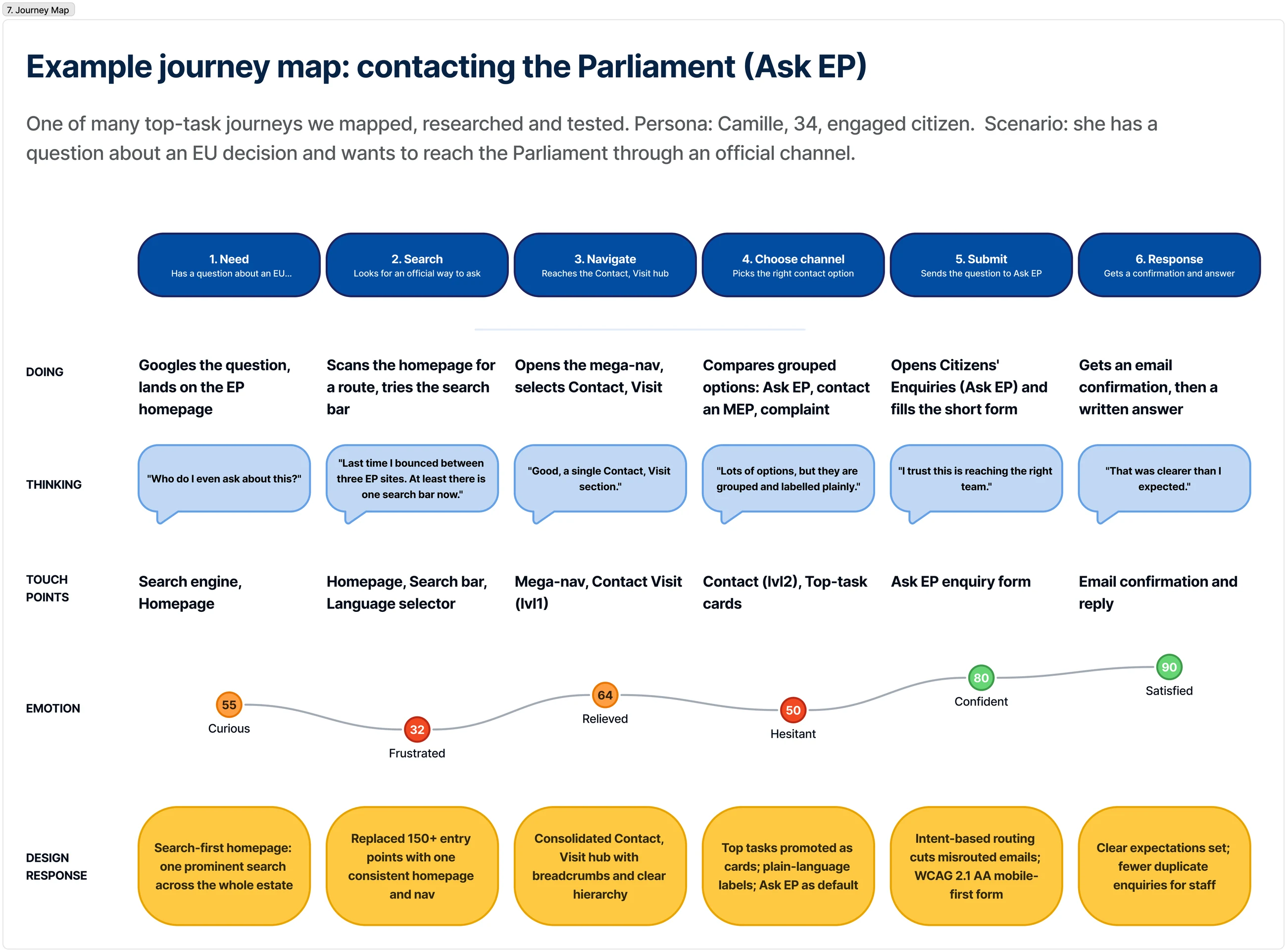
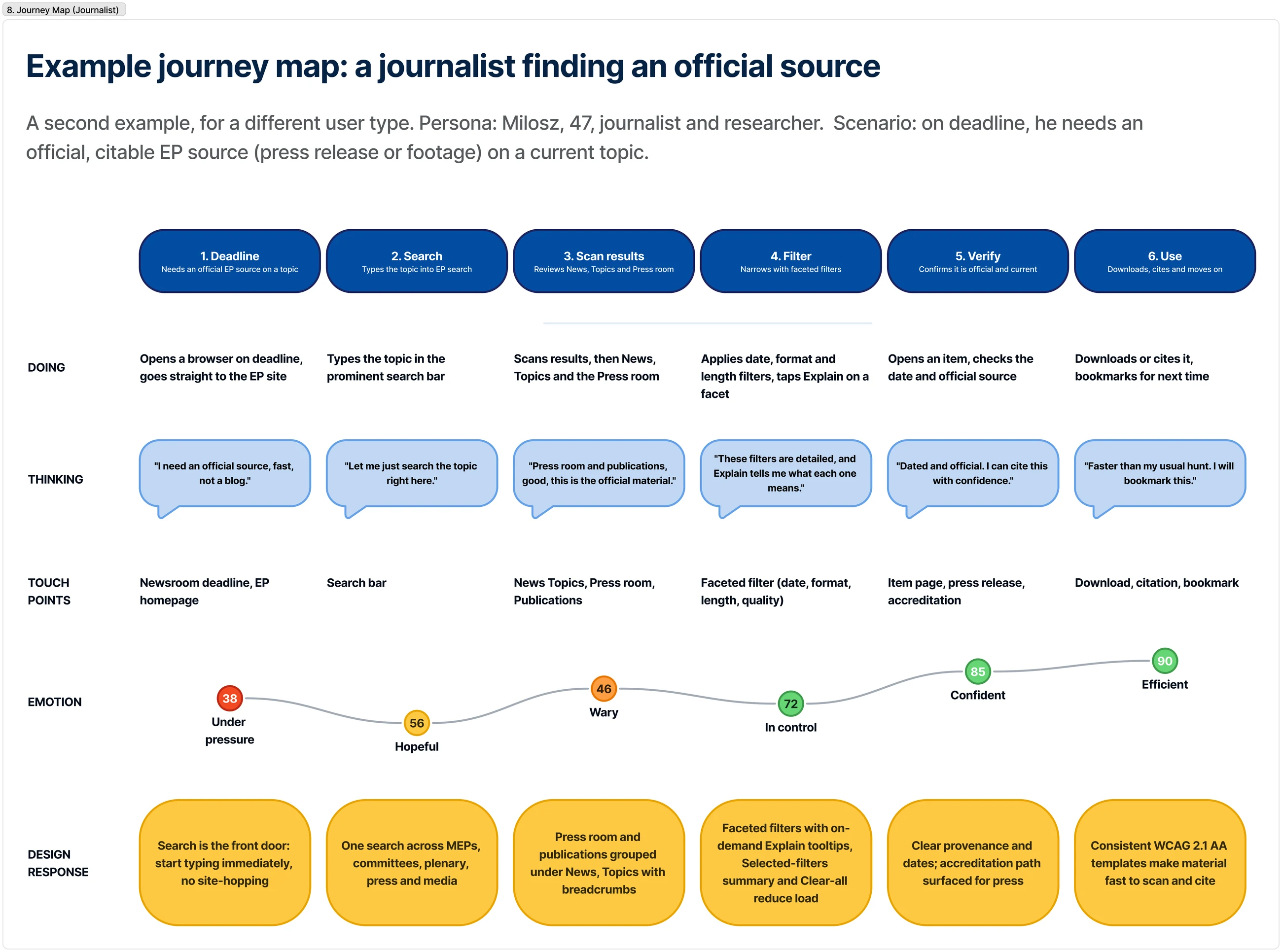
To make sure the structure held up against real behaviour, we mapped the priority journeys end to end, emotional highs and lows included, and tied each stage to a specific design decision. These are two of the many top-task journeys we mapped and tested.
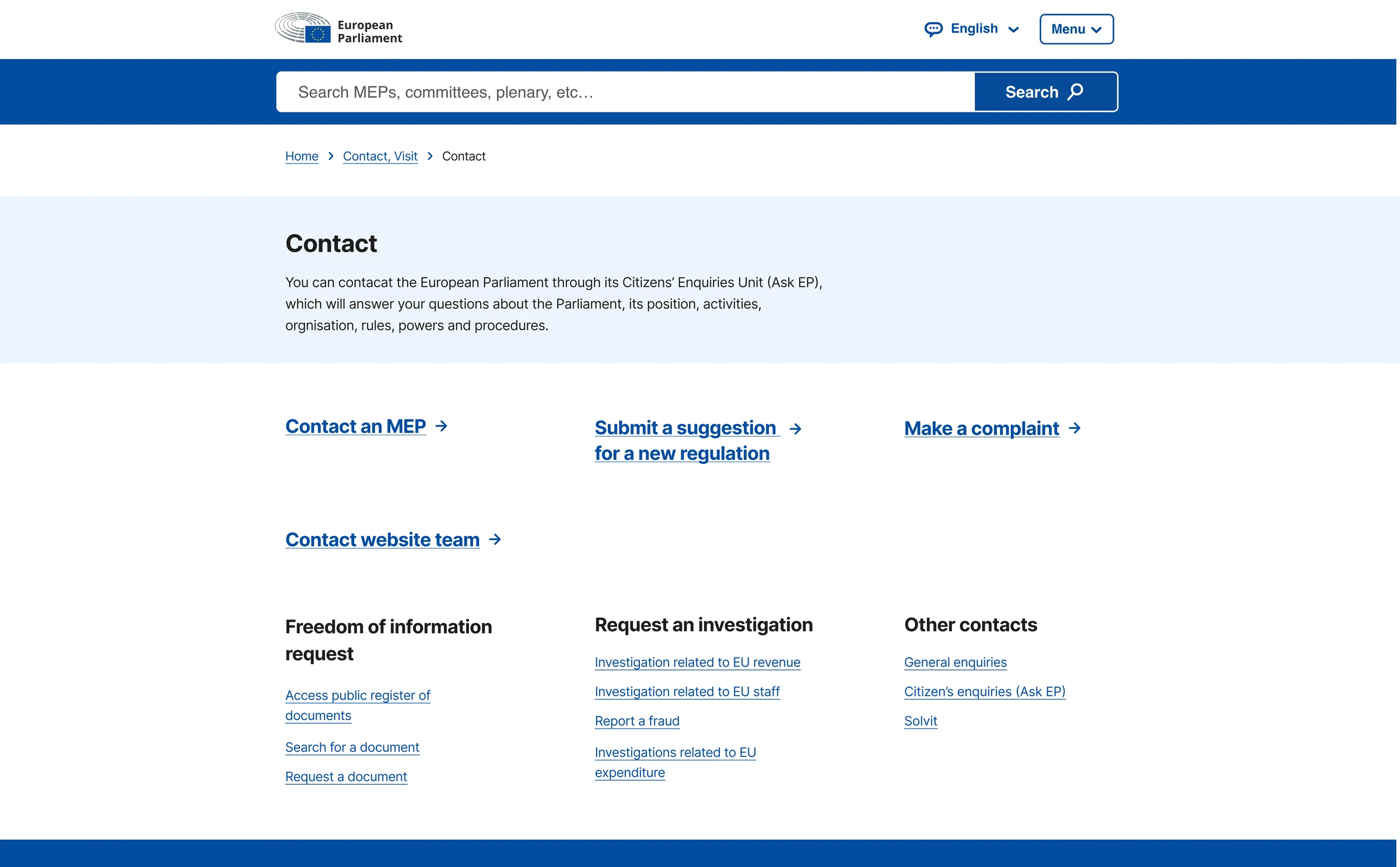
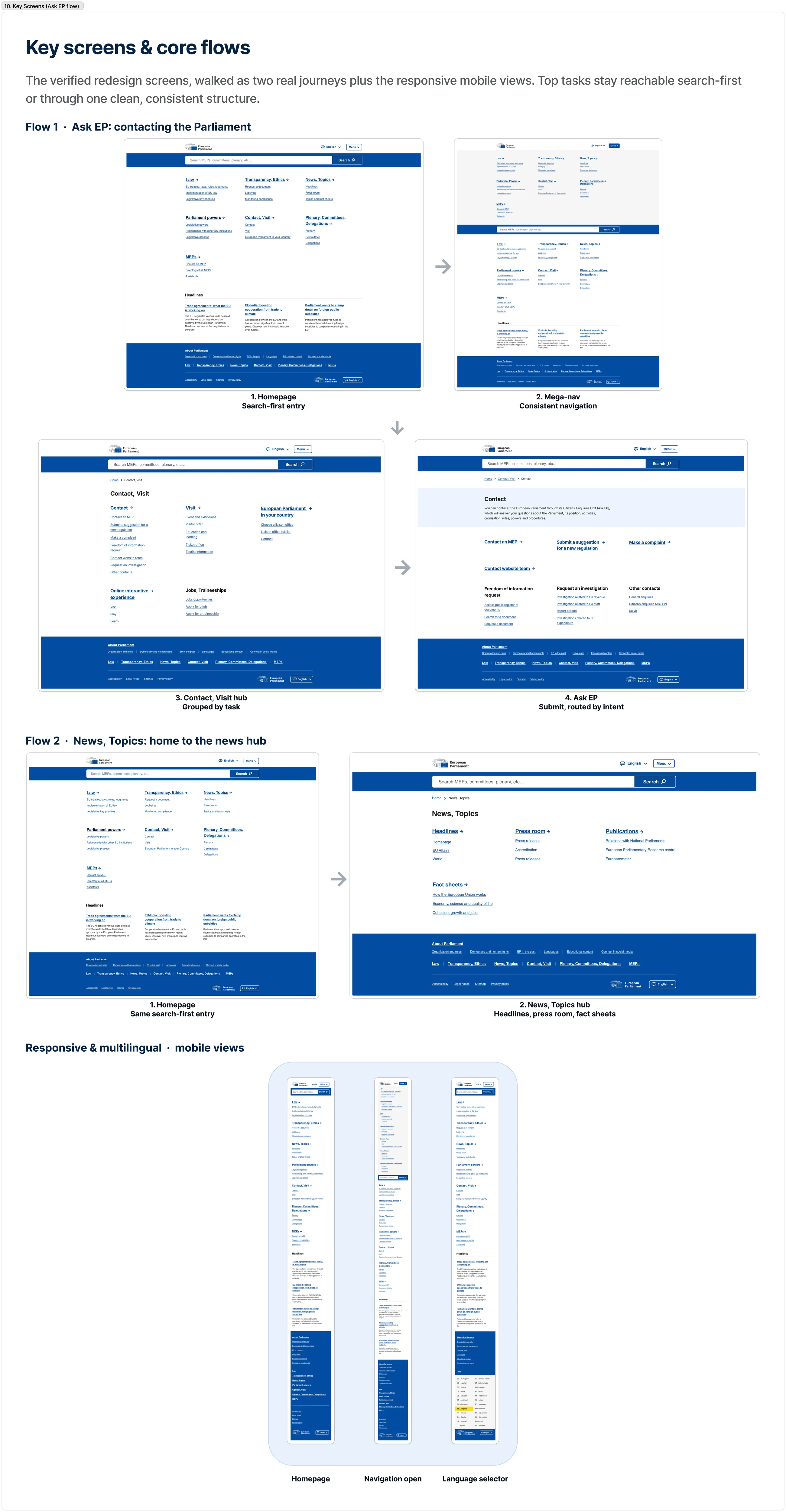
Contacting the Parliament: Camille moves from the homepage, through search or the consolidated Contact, Visit hub, to submitting an enquiry via the Citizens' Enquiries Unit (Ask EP), routed by intent, which is what cuts misrouted emails. Finding a source: Milosz searches a topic, then narrows with a faceted filter that explains each facet on demand.
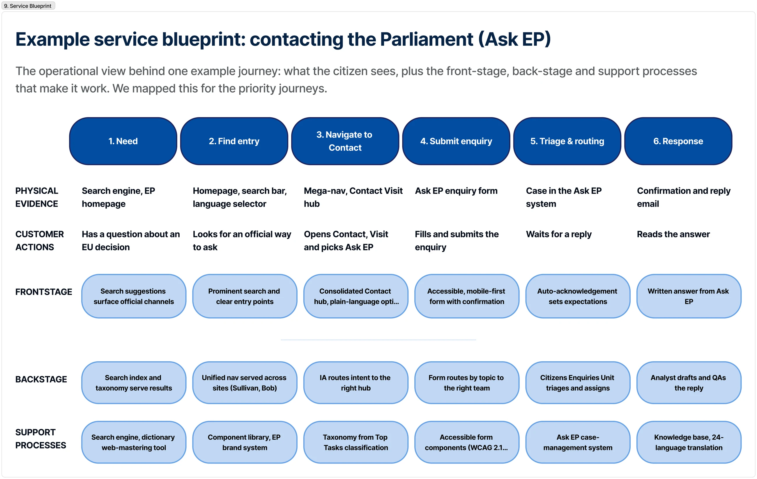
To connect the citizen-facing journey to what happens behind the scenes, I mapped the Ask EP contact service as a blueprint: customer actions, front-stage, back-stage (routing, the Enquiries Unit, drafting and QA), and the support systems beneath (search index, the Top Tasks taxonomy, accessible form components, 24-language translation).
It makes clear why intent-based routing, not a prettier form, is what reduces misrouted enquiries.
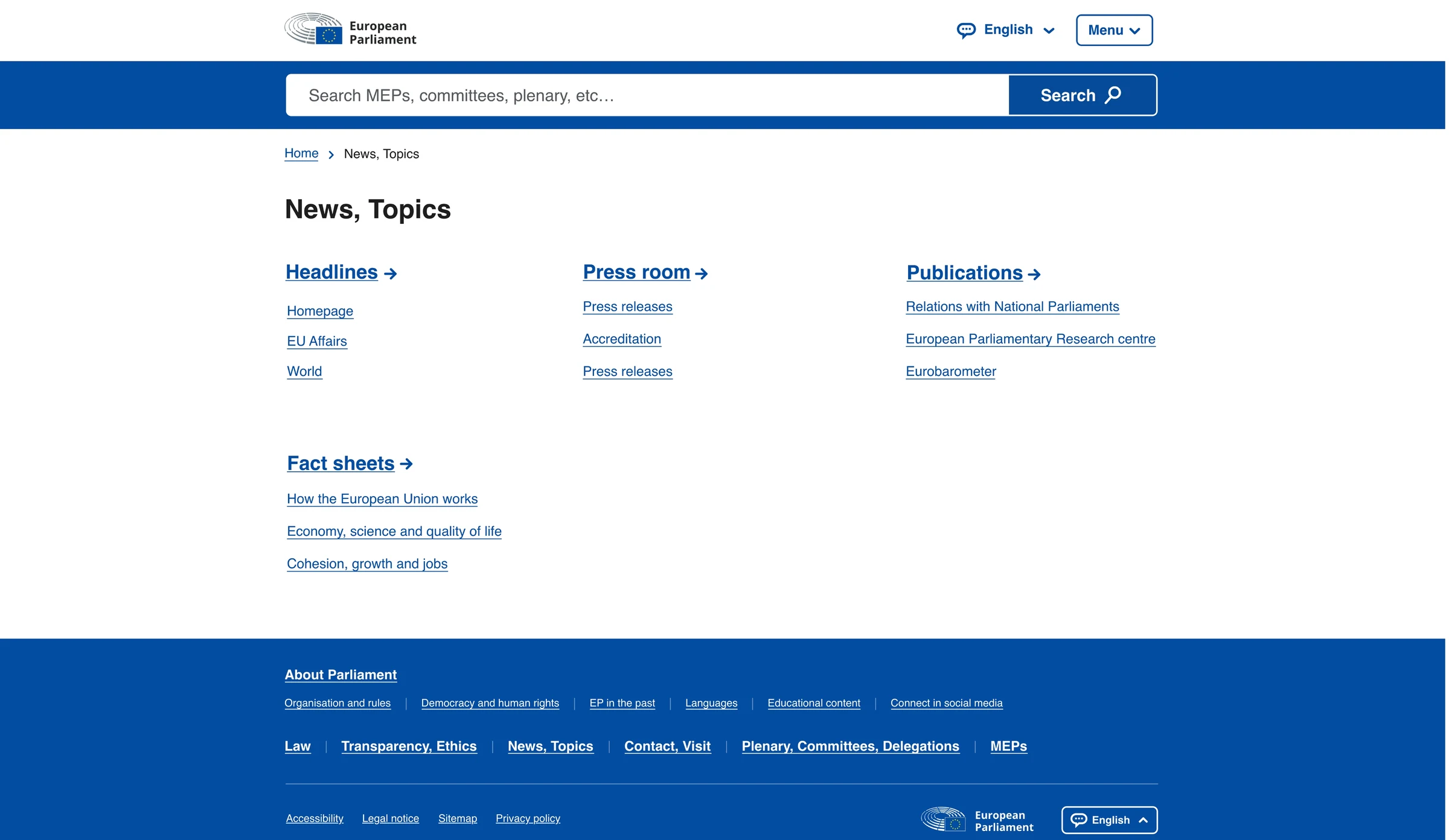
The redesigned platform leads with search, consolidates scattered pages into clear task-based hubs, and keeps complex tools usable through progressive disclosure. The same clarity holds on mobile, with language selection always within reach. The screens below are the real interface behind the journeys mapped above.
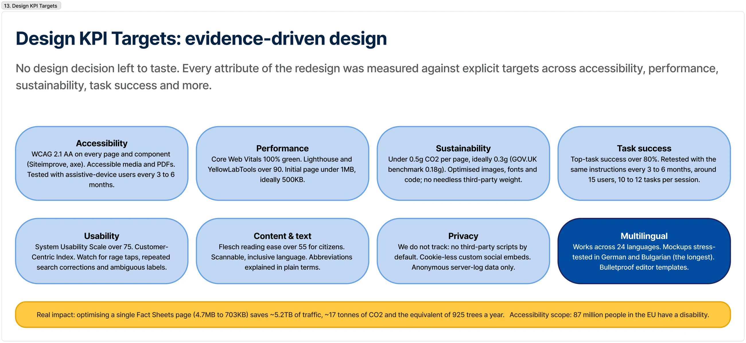
Accessibility was a first-class requirement, not a final audit. Working toward WCAG 2.1 AA shaped the components and interaction patterns themselves: correct contrast, focus, keyboard operation and semantics by default; plain-language labels; progressive disclosure; mobile-first layouts; consistent navigation.
Success was measured with the Task Performance Indicator (Gerry McGovern's TPI): success rate and completion time per top task, retested with the same instructions every few months, triangulated with a System Usability Scale above 75. The targets even covered sustainability: optimising one Fact Sheets page from 4.7 MB to 703 KB saves the carbon equivalent of about 925 trees a year.
At institutional scale, the information architecture is the design.
The most valuable decision was to let real tasks, not the org chart, drive the structure, and to make search the front door. The visual design then had a clear job: make that structure obvious and accessible to everyone, on any device, in any language. Next, I'd invest in continuous task & search-analytics monitoring, so the taxonomy keeps adapting rather than being re-audited only at the next redesign.
Maison Médicale
From a confusing, phone-dependent clinic site to a clear, mobile-first booking and patient tool.
callsRepetitive inquiries deflected & routed
The old site's convoluted navigation and undifferentiated services (psychology versus neuropsychology, for example) misrouted patients and hid the things they needed. Reception fielded the same basic questions by phone and email all day.
It was organised around the practice, not the patient: navigation by person (you had to know the doctor to book), and “booking” was really a phone call behind a button.
At a small clinic, clarity is the whole game: name and organise services the way patients think.
As Lead UX/UI Designer across research, UI and integration, I led the redesign end to end: rebranding, service reorganisation and a rebuild of the form logic. The work followed the Double Diamond, understanding the problem with staff and patients before committing to a solution.
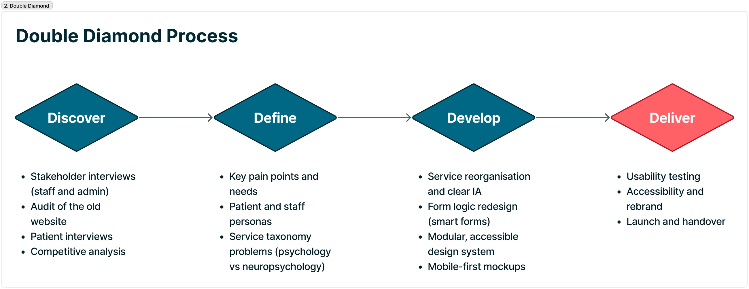
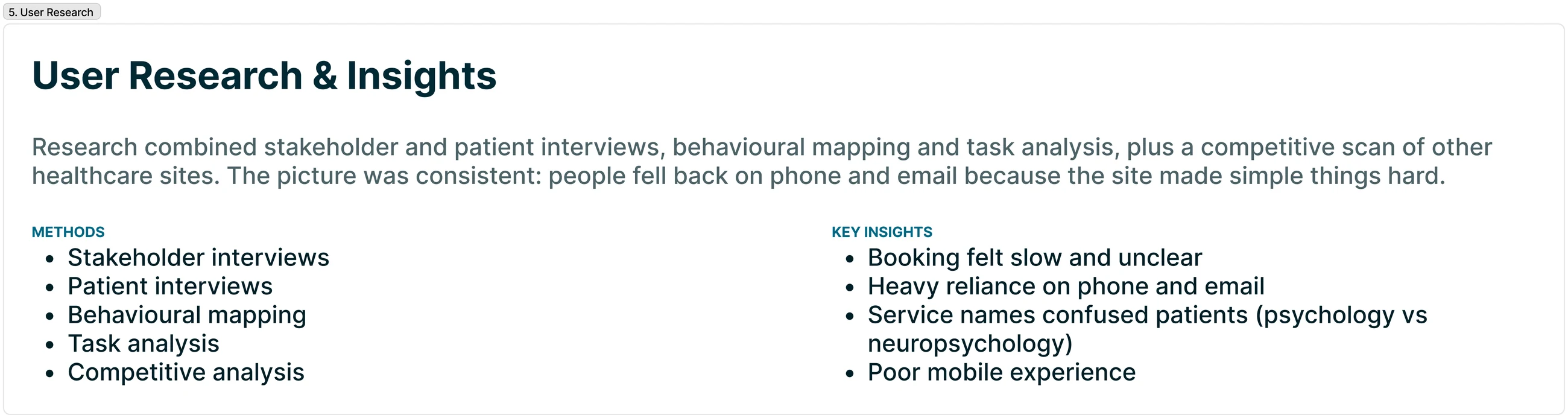
I combined stakeholder and patient interviews with behavioural mapping, task analysis and a competitive scan of other healthcare sites. The picture was consistent: people fell back on phone and email because booking and finding the right practitioner online were unclear, and the mobile experience was poor.
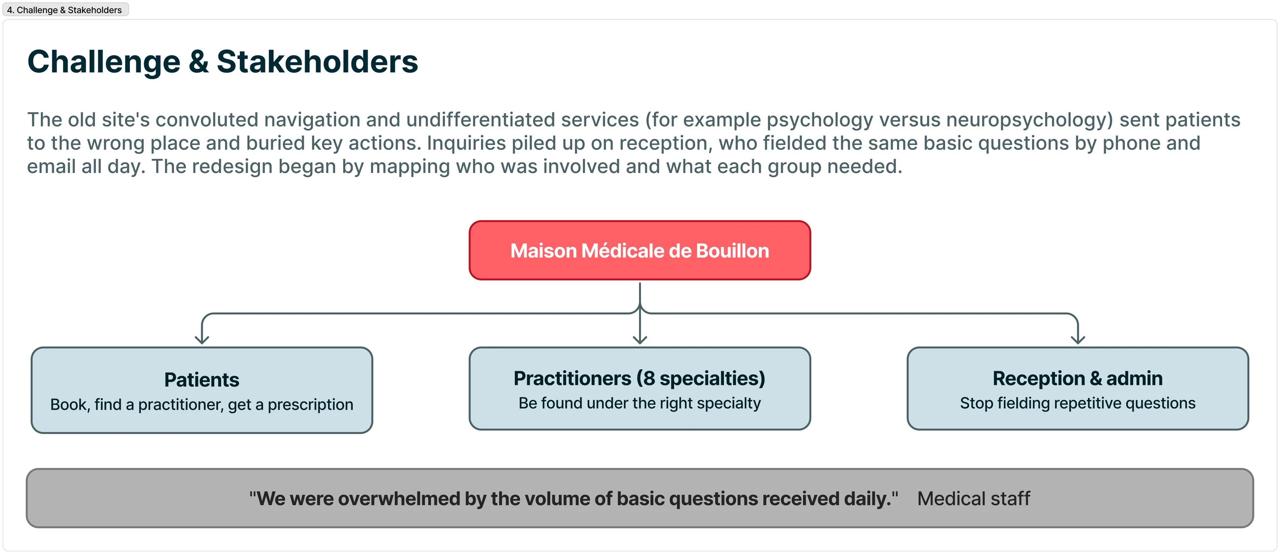
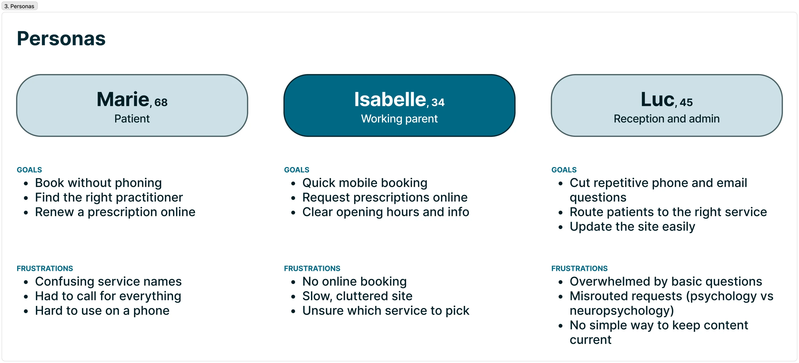
Personas kept the work anchored to real needs: Marie, a rural patient who wants to book without phoning; Isabelle, a working parent who needs quick mobile booking; and Luc on reception, who needs to stop fielding repetitive questions and route patients to the right service.
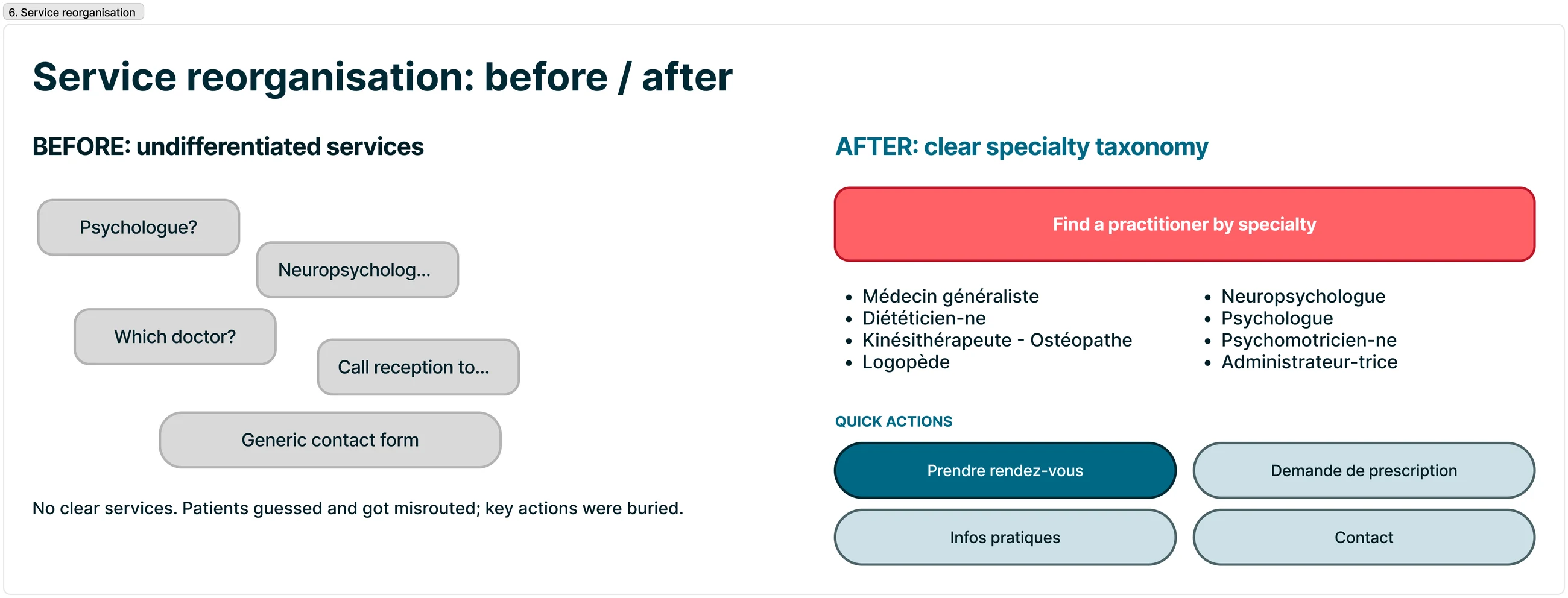
The core fix was the information architecture. Undifferentiated services became a clear taxonomy of eight specialties, from Médecin généraliste to Administrateur, so patients reach the right practitioner instead of guessing. Quick actions (Prendre rendez-vous, Demande de prescription, Infos pratiques, Contact) stay within reach.
This is what resolved the psychology-versus-neuropsychology misrouting.
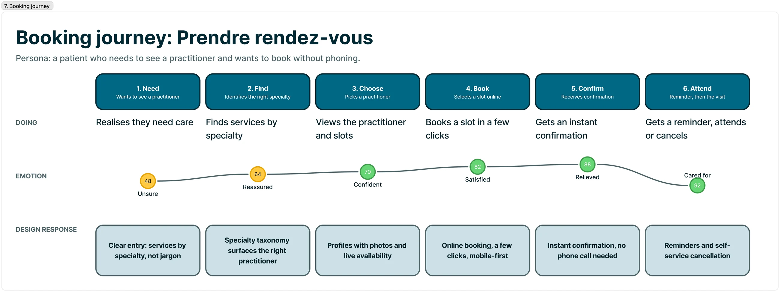
I mapped the priority journey, booking an appointment, end to end and tied each stage to a design decision: services by specialty at the entry, practitioner profiles with photos, online booking through the practice's platform or by phone with clear hours, and self-service cancellation to cut no-shows and repetitive calls.
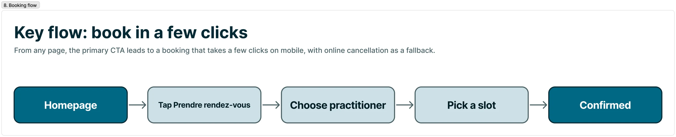
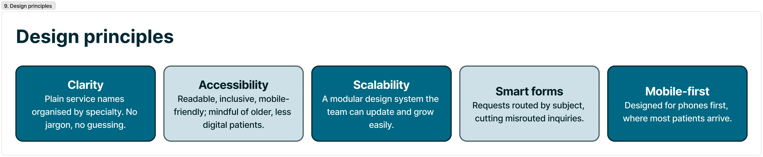
Contact and prescription requests run through a subject-routed form (prescription or exam result vs. general information), which sends each request to the right place and cuts misrouted inquiries. The redesign held to four principles: clarity, accessibility, scalability and mobile-first, readable and inclusive for older and less digital patients.
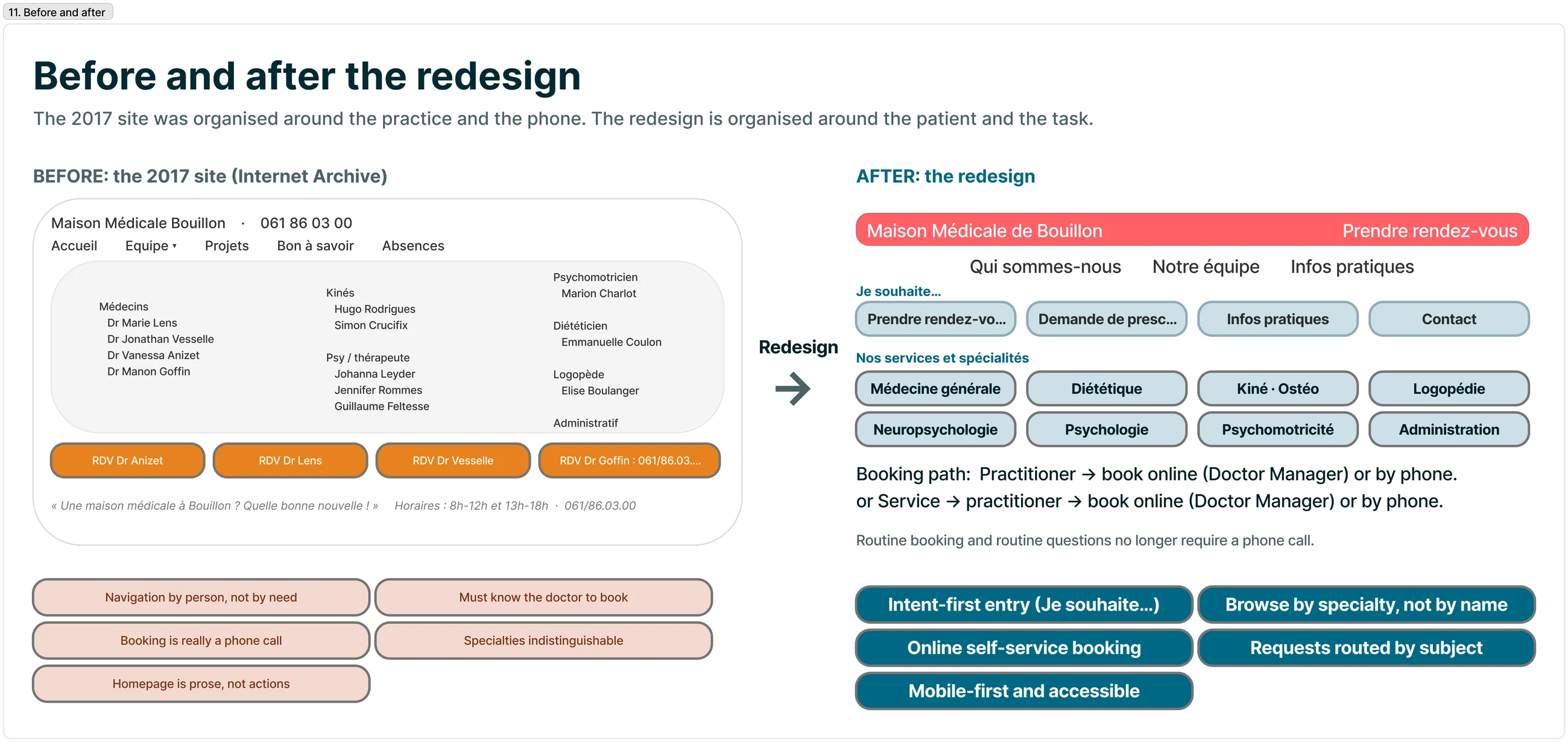
The original 2017 site (preserved on the Internet Archive) was built around the practice: navigation by person, “booking” that was really a phone call, services undifferentiated, a homepage that opened with welcome prose instead of actions.
The redesign inverts this: the patient lands on intent (“Je souhaite…”), browses by specialty rather than by name, books online or by phone, and sends requests through a subject-routed form. Same clinic, reorganised around what people actually came to do.
The redesigned site, live: organised by specialty, easy to book, routed to the right place. Clear on mobile too, where most patients arrive.
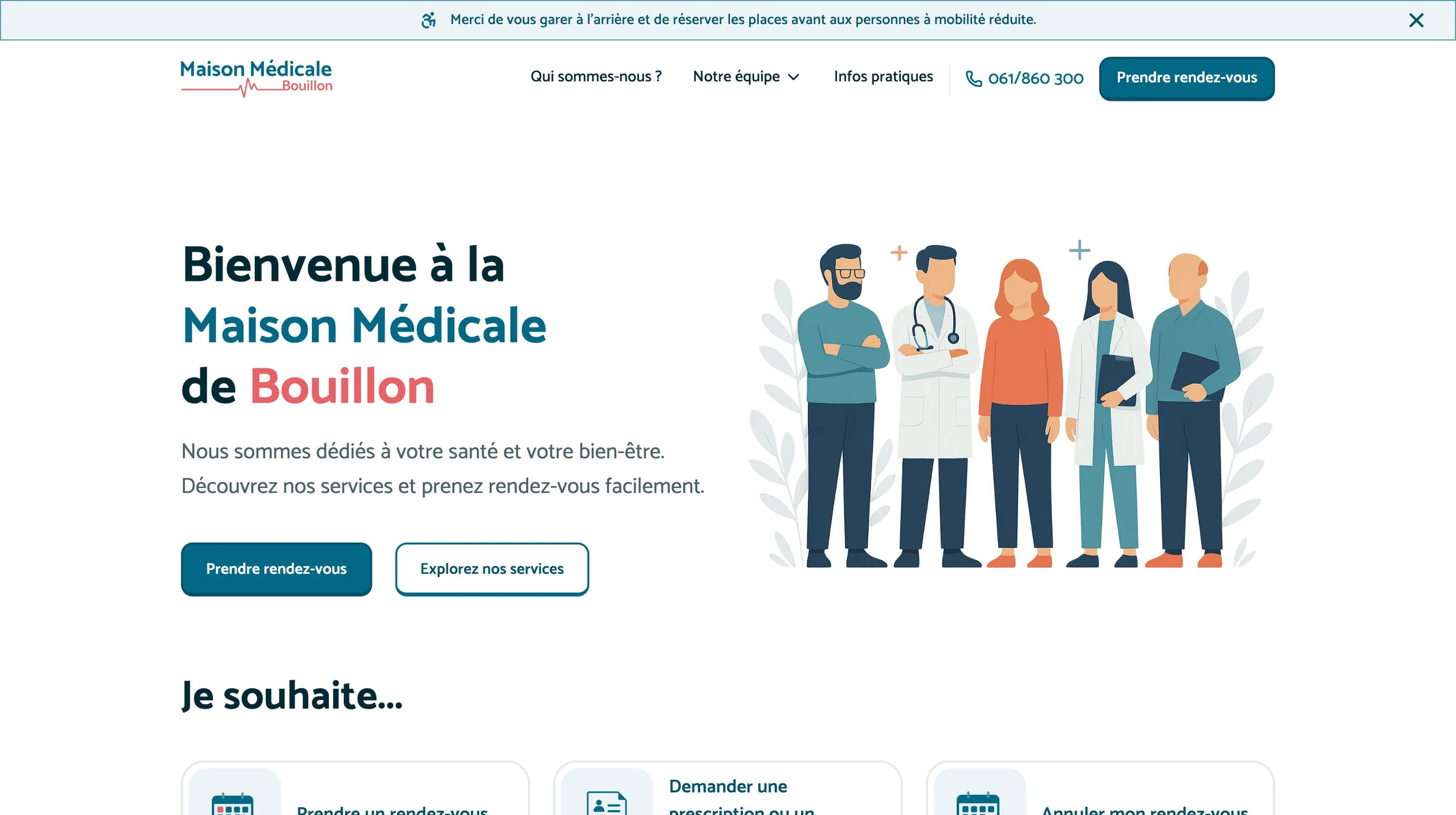
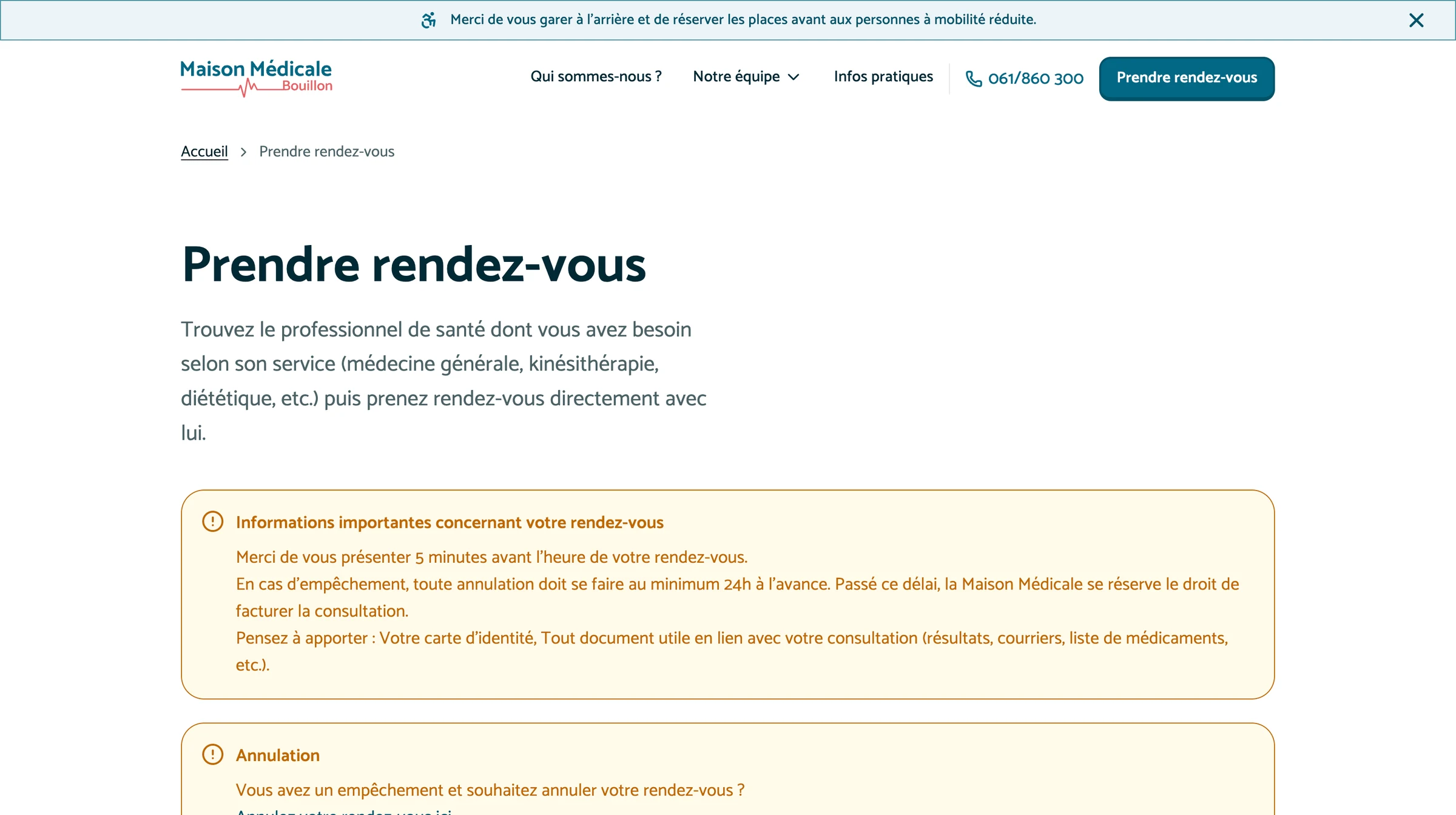
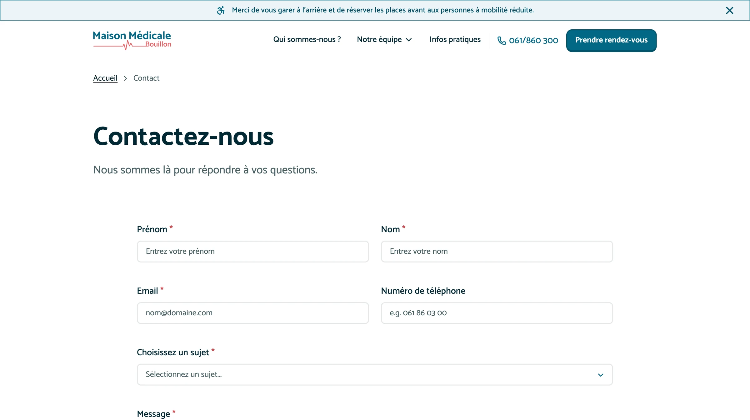
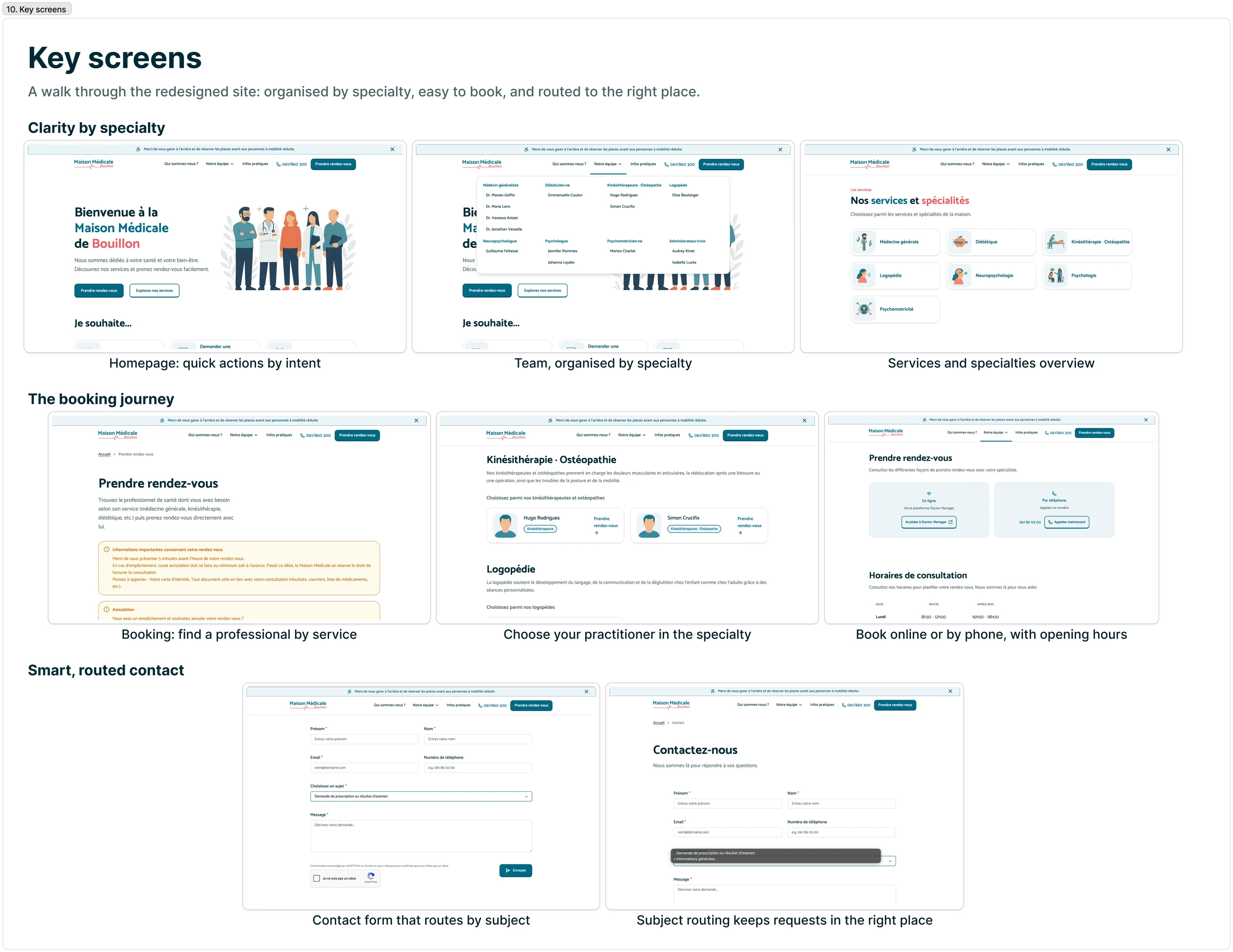
“The new layout makes it much easier for patients to quickly find what they need.” — Clinic administrator
At a small clinic, clarity is the whole game. The biggest lever was naming and organising services the way patients think, by specialty and by action, and removing the phone call from simple tasks. The modular design system keeps it maintainable for a team without dedicated digital staff.
Scalable Design System
One governed library that unified 150+ sites across HTML, React & Angular.
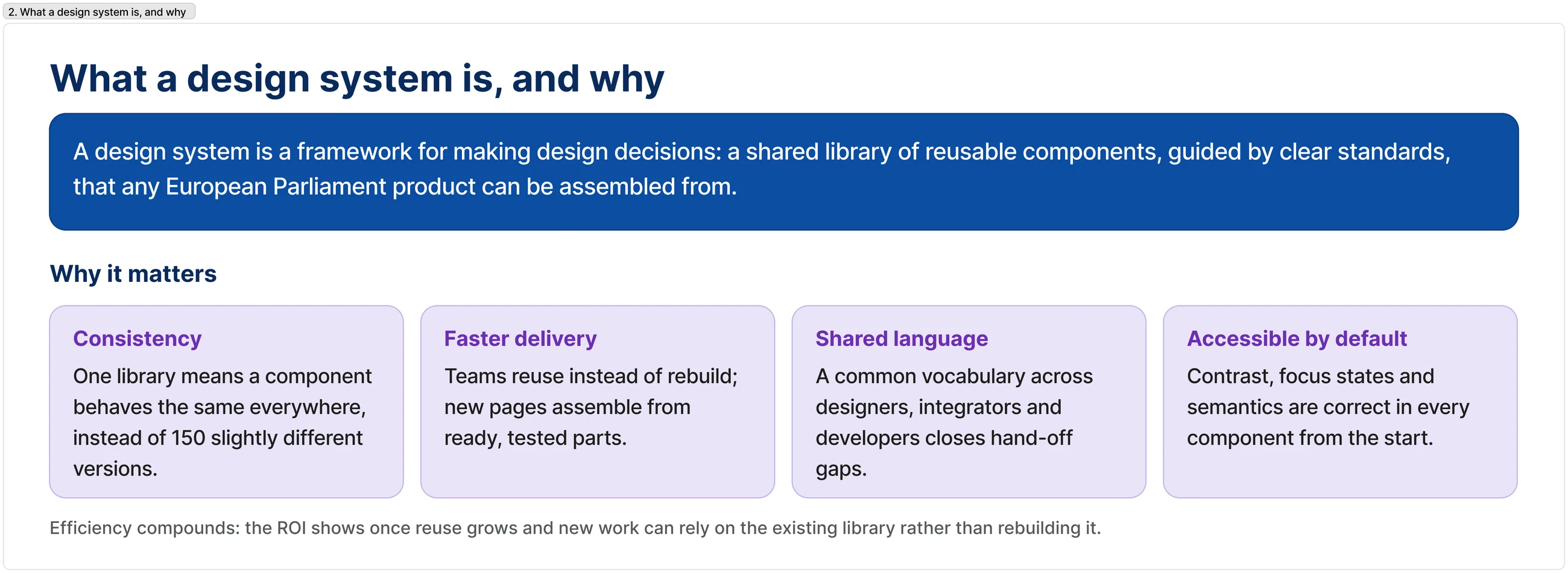
After 12 years, the EP's web estate had become 150+ inconsistent sites, each with its own styles, components and code. The same button behaved differently everywhere, and consistency, accessibility and delivery speed all suffered.
A design system is a product, not a style guide. The value is governance.
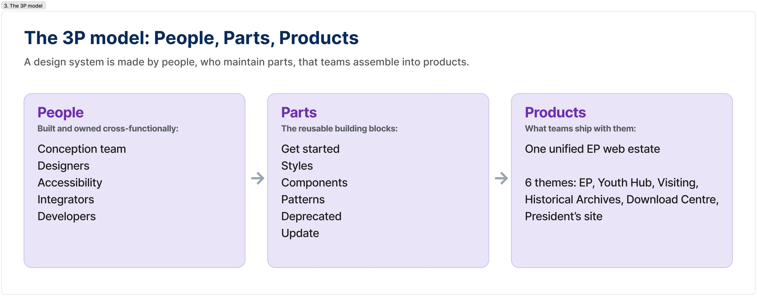
We organised the system around the 3P model (People, Parts, Products): the cross-functional people who build and own it, the reusable parts (styles, components, patterns) they maintain, and the products teams ship with them across one unified EP web estate.
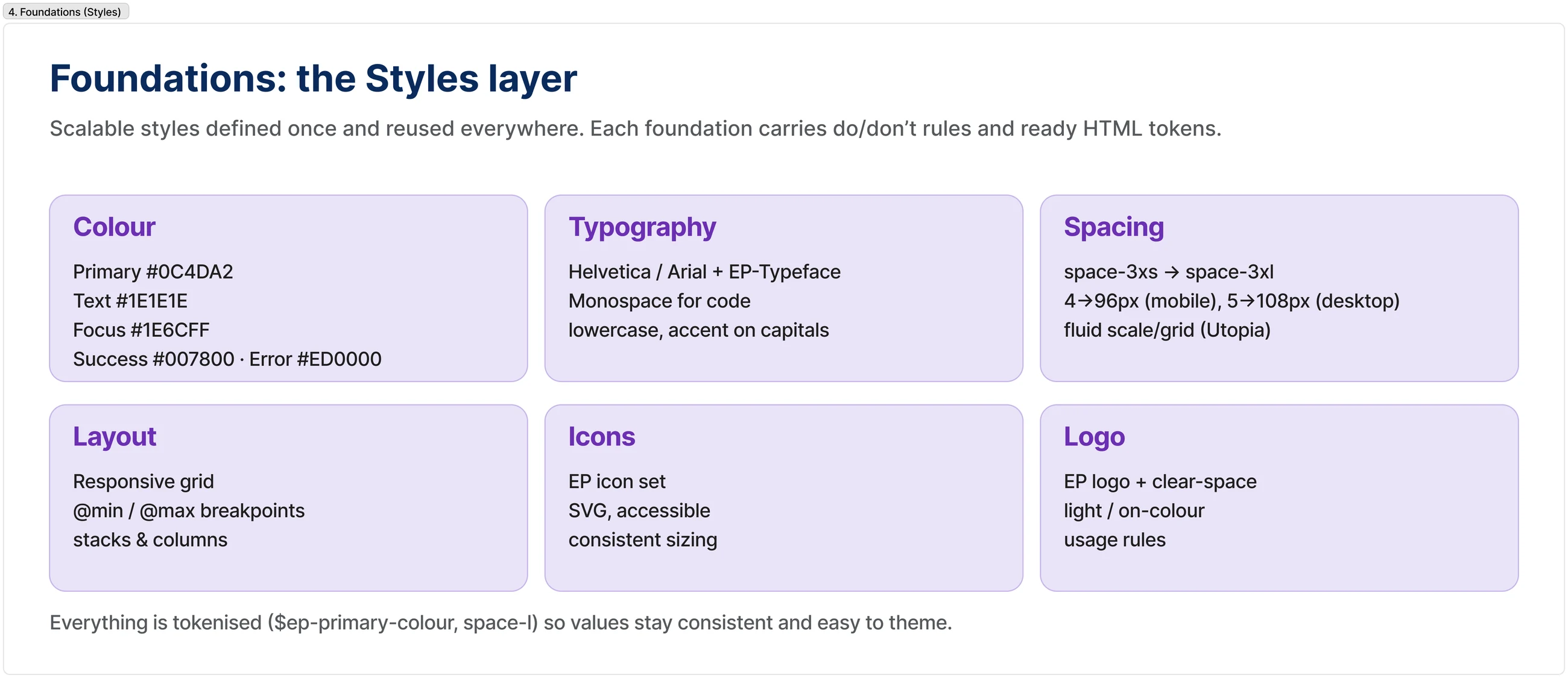
I helped define the tokenised Styles foundations: colour, typography, a fluid spacing scale, layout, icons and logo. Because every value is a token, the same foundation re-skins cleanly across themes and ships identically to every framework.
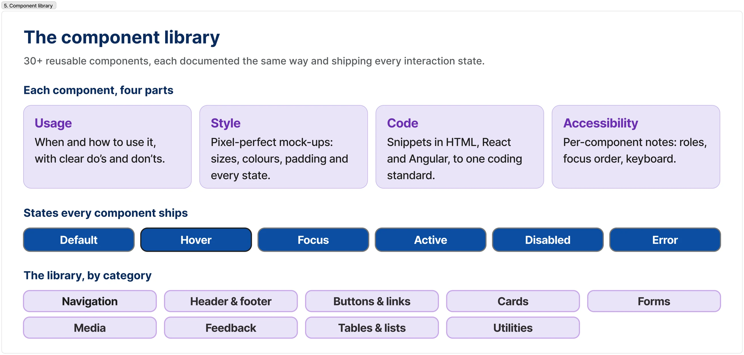
30+ reusable components, each documented four ways (Usage · Style · Code · Accessibility) and covering every state, with a lifecycle status so teams know what's stable, draft or deprecated.
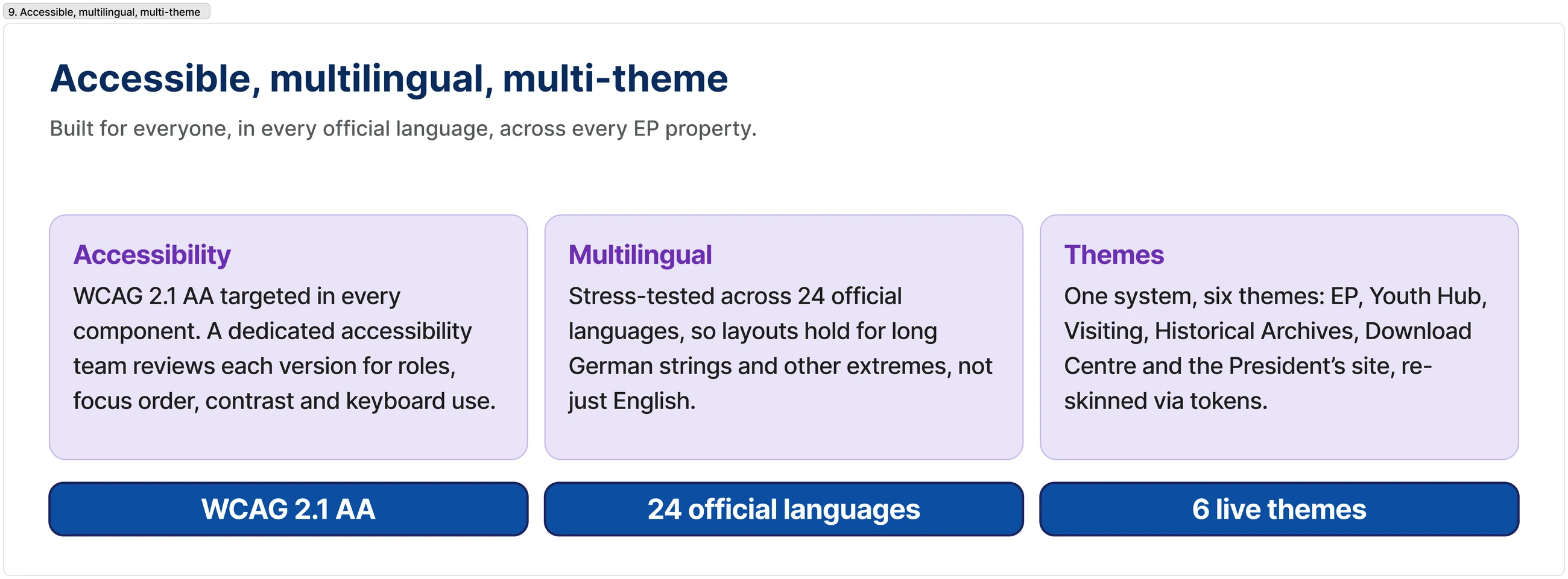
Above components sit patterns: proven, accessible solutions for recurring flows like forms, the global header, search and navigation, so teams assemble pages from validated building blocks instead of reinventing them.
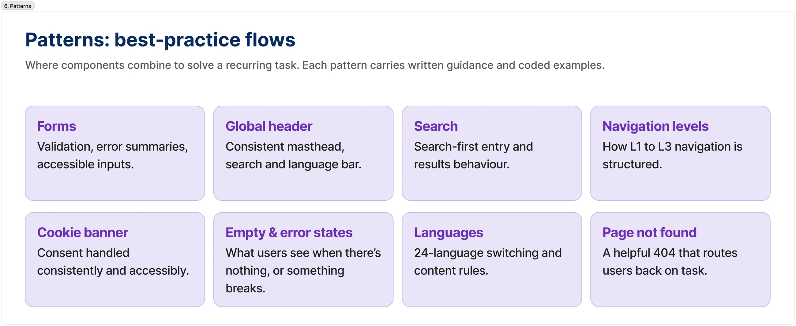
The system runs on a 5D workflow (Discover, Design, Develop, Document, Deliver) plus a component-lifecycle checklist and staging-to-production governance, so contributions are consistent and quality stays high as the system grows.
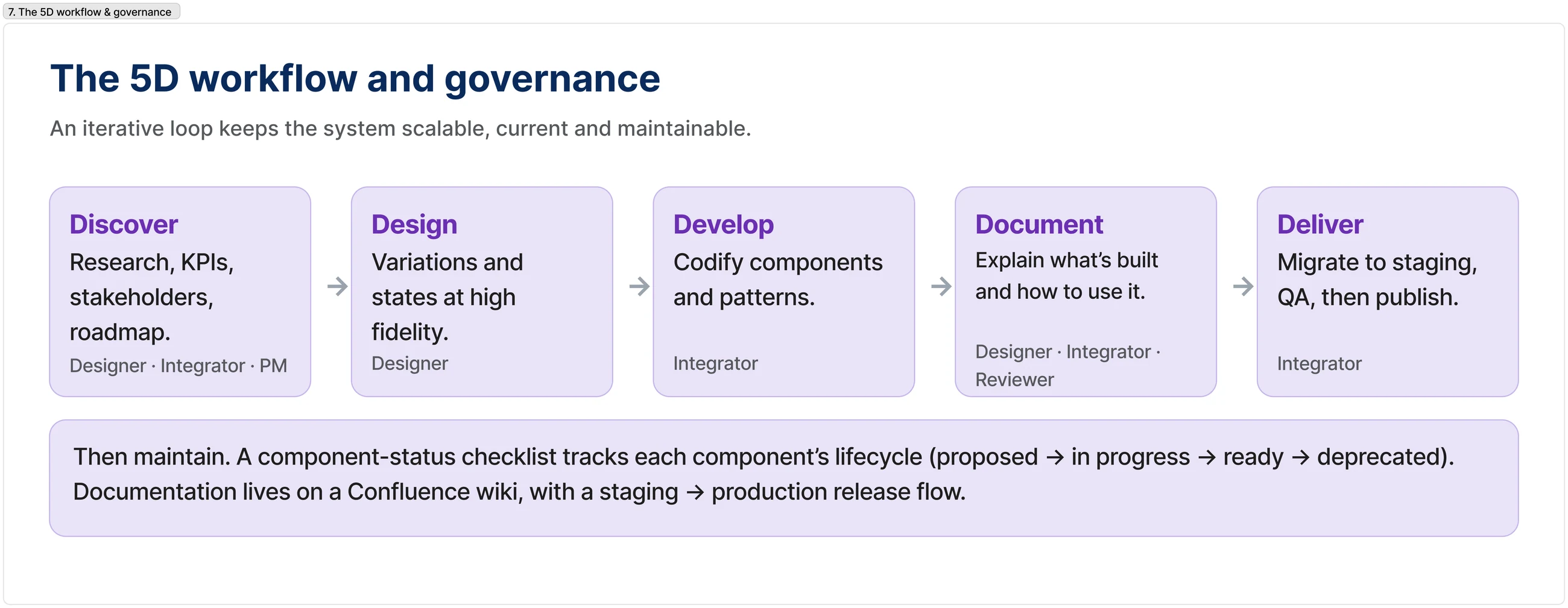
Shared design tokens feed HTML, React and Angular off the European Commission's ECL base, so a component is documented once and renders identically in every framework. The result: 3× component reuse in the first year and about 60% less design-to-dev handoff time.
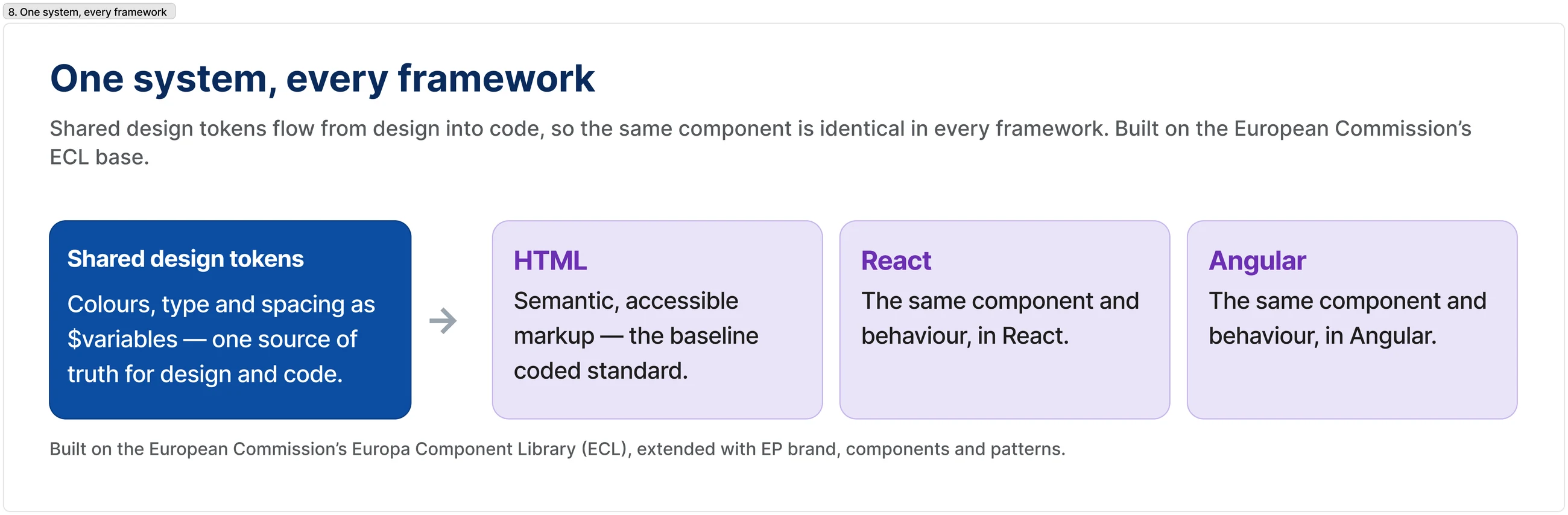
Every component targets WCAG 2.1 AA, reviewed by a dedicated accessibility team; was stress-tested across 24 official languages (including German and Bulgarian); and re-skins through tokens for 6 themes: EP, Youth Hub, Visiting, Historical Archives, Download Centre and the President's site.
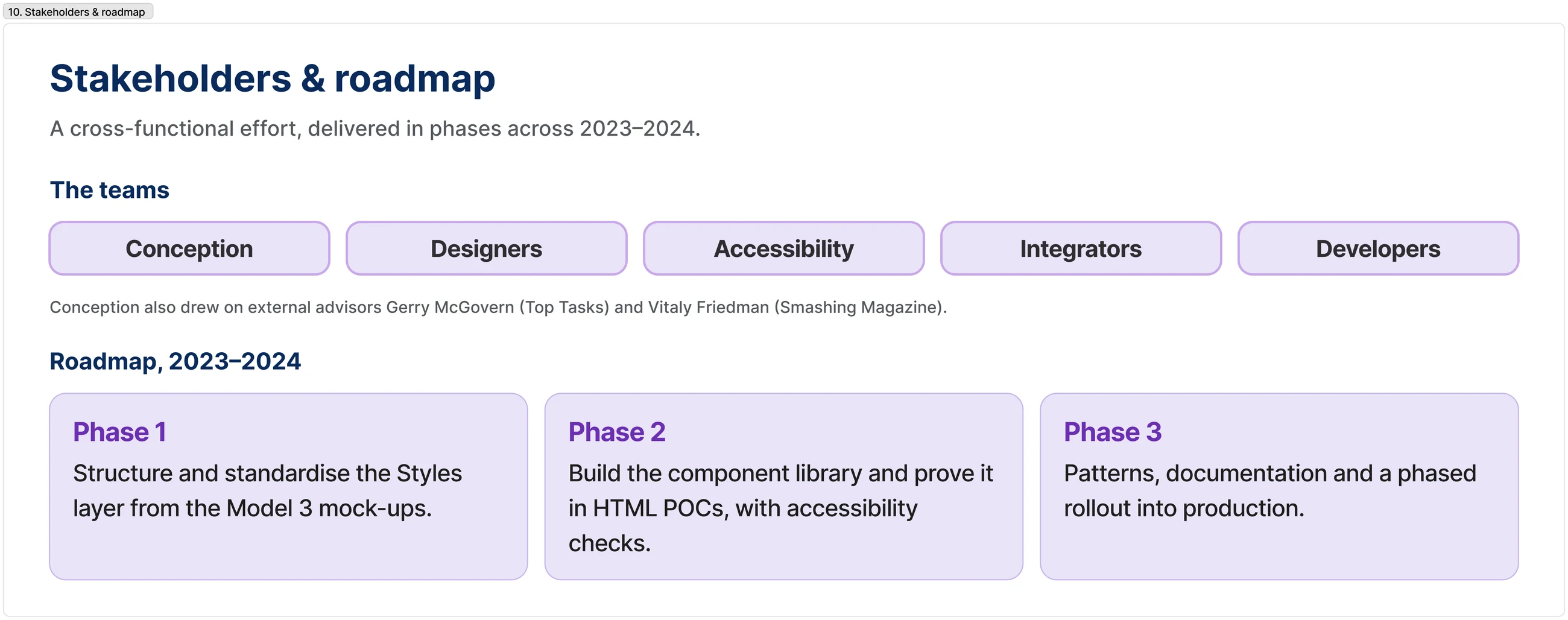
A design system only survives if it's owned. The work was delivered as a cross-functional effort in phases across 2022–2024, with conception, design, accessibility, integration and development each owning a stake in the system's health.
The library, foundations and patterns documented end to end: one source of truth that lets designers and developers ship faster.
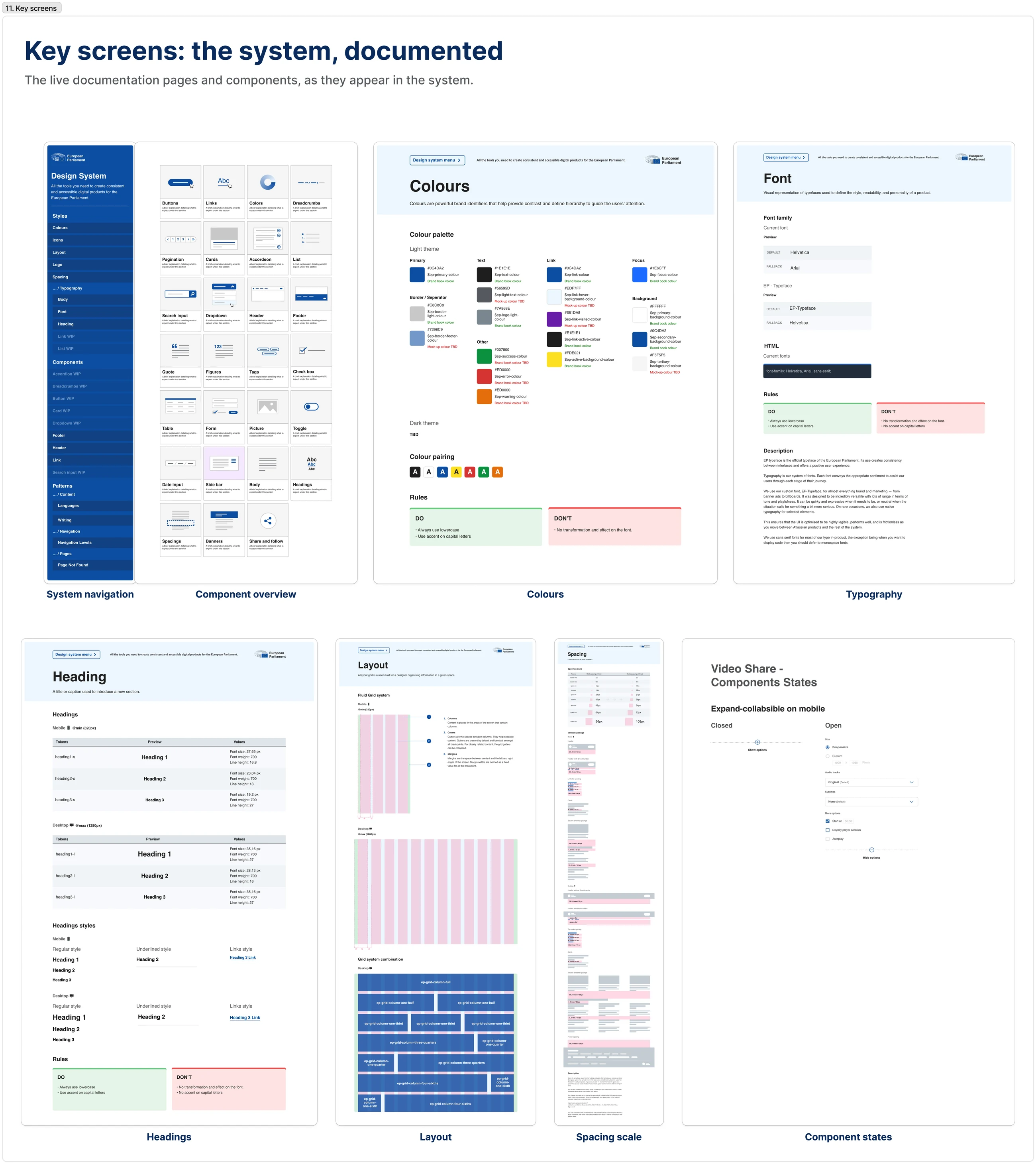
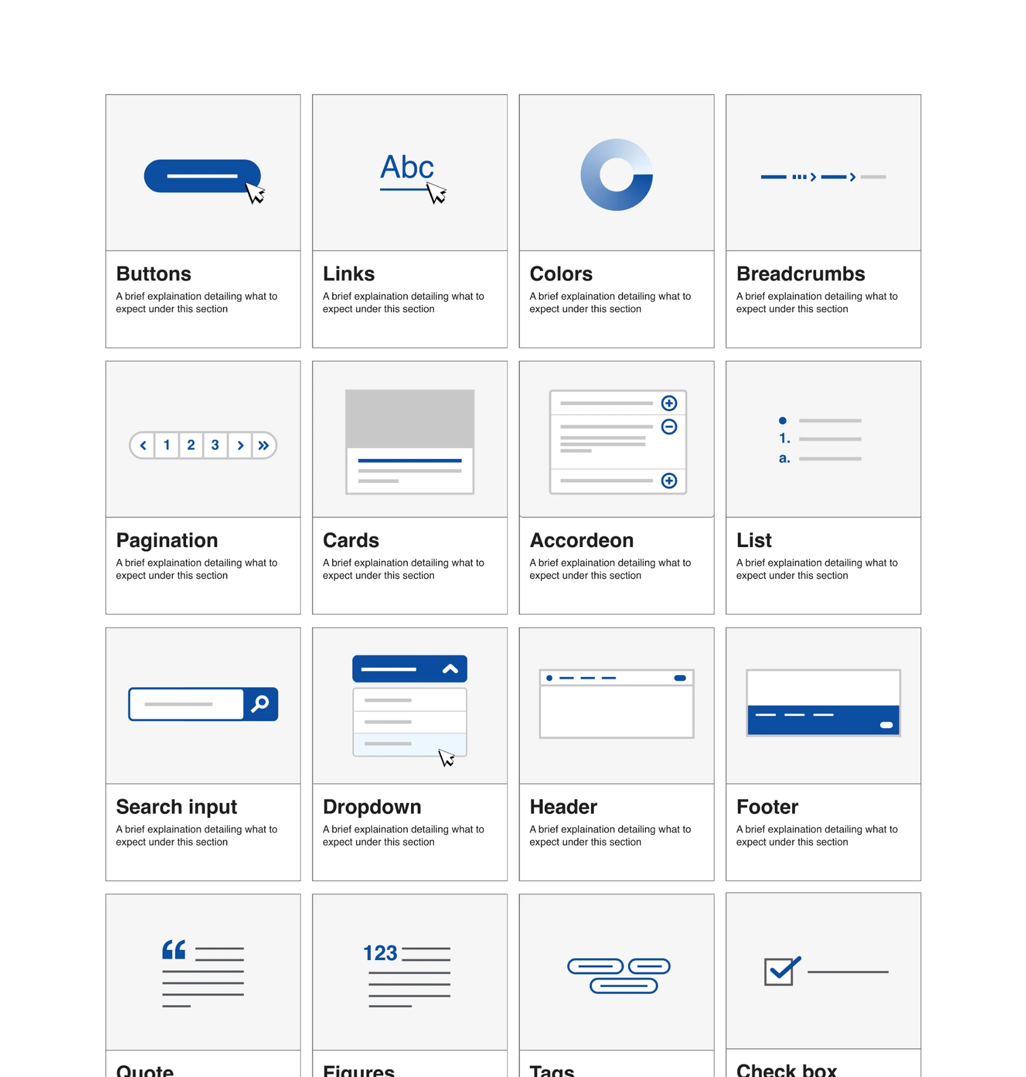
The value isn't the components. It's the governance that makes consistency and accessibility the default.
Building on the EC's ECL rather than reinventing it meant the system could extend a proven base and focus its energy on EP-specific needs, multilingual robustness and the workflow that keeps it healthy as it scales.
ZenDare Wellness
Turning healthy living into a guided journey of small, repeatable daily habits.
AndroidLive beta from a single build
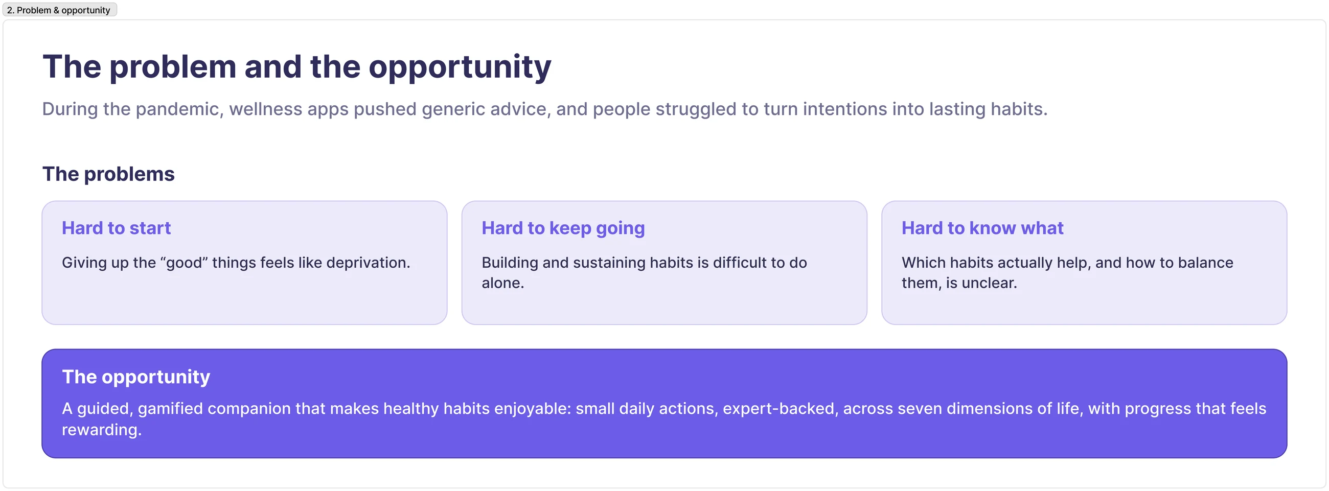
During the pandemic, wellness apps pushed generic advice and people struggled to build lasting habits. A small startup wanted something engaging and expert-backed instead. I owned UX/UI from concept to a live beta I also helped build.
Don't try to fix someone's whole life at once. Make one habit loop genuinely enjoyable and repeatable.
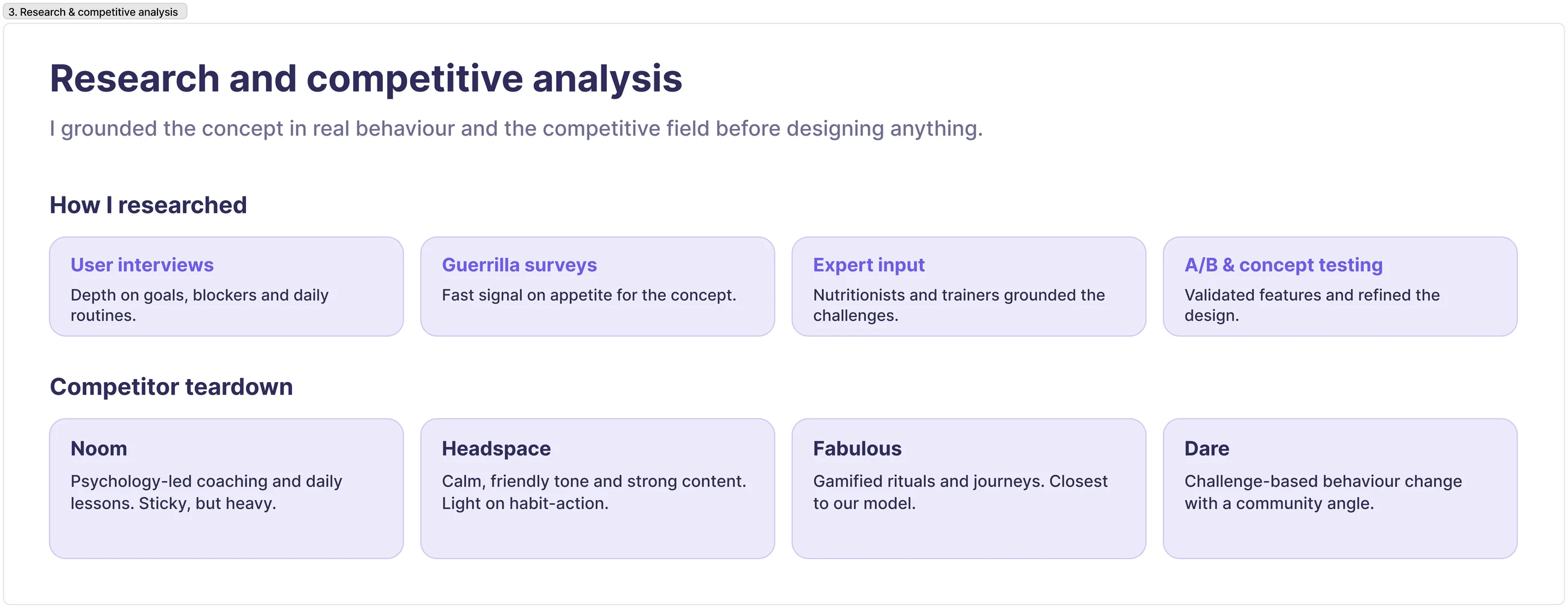
I ran interviews and guerrilla surveys, and a competitor teardown of Noom, Headspace and Fabulous, mapping where each kept people engaged and where they lost them. The gap: an experience that's genuinely fun and expert-backed, not just a content library.
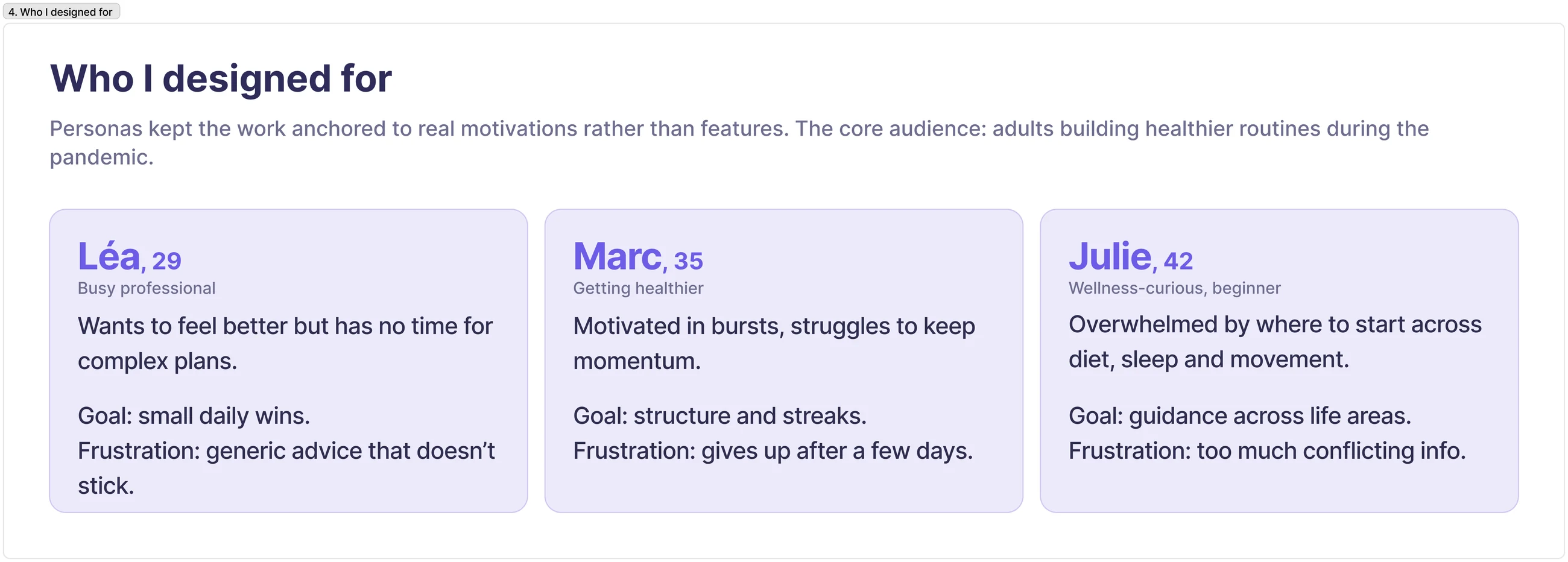
Personas, reconstructed from the documented target audience, kept the work grounded in real motivation and drop-off points rather than feature wishlists.
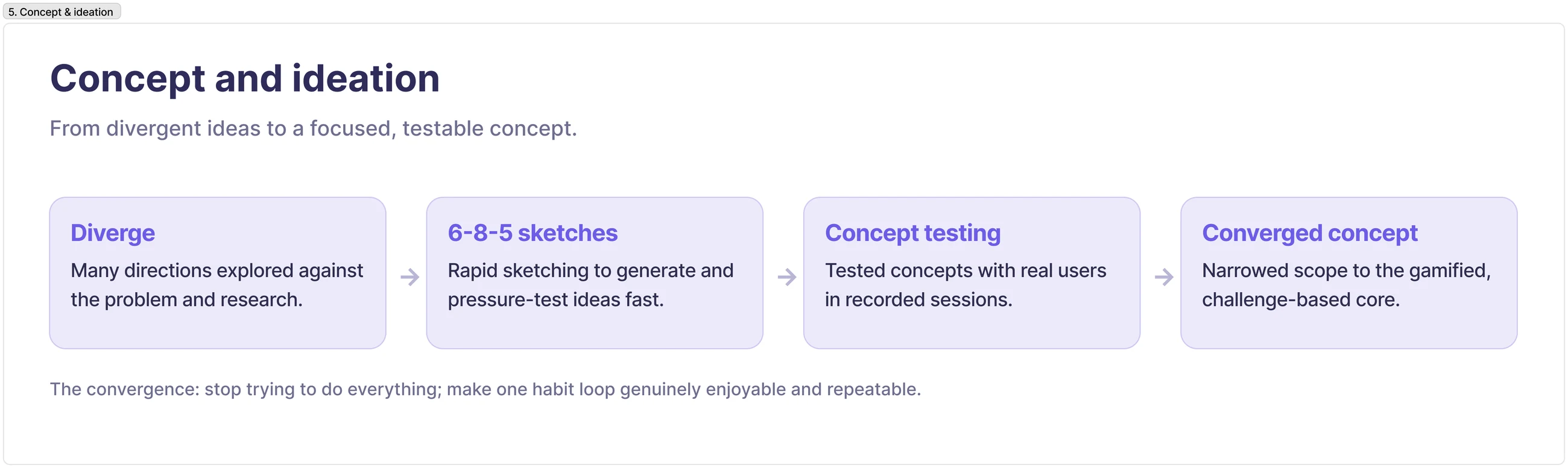
I brought in nutritionists and trainers for credibility, sketched with 6-8-5, and concept-tested with real users (recorded sessions) before converging the scope. That's where the “guided journey of small daily habits” concept earned its place.
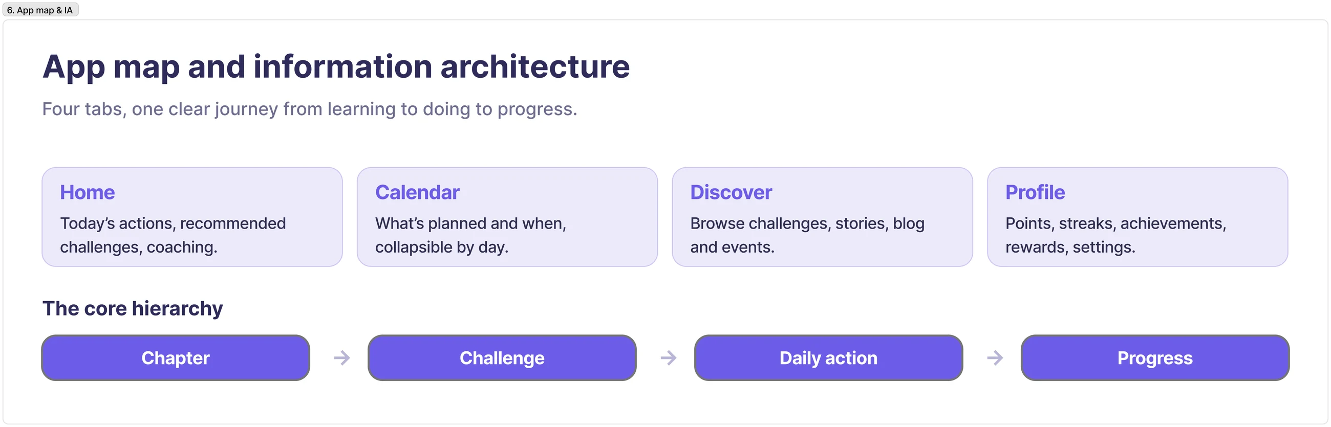
The app map organised the experience across seven wellness dimensions and the core loop, keeping discovery, tracking and rewards each one tap from where you'd expect them.
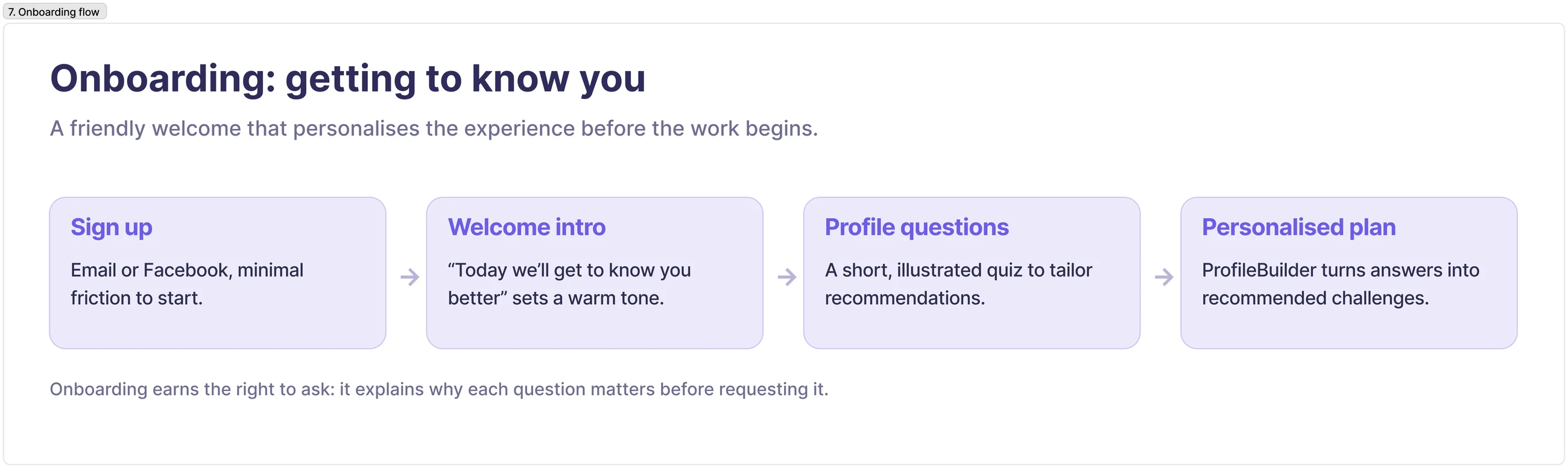
Onboarding doubles as personalisation: a few quick questions tune the journey to the user's goals, so the app feels relevant from day one.
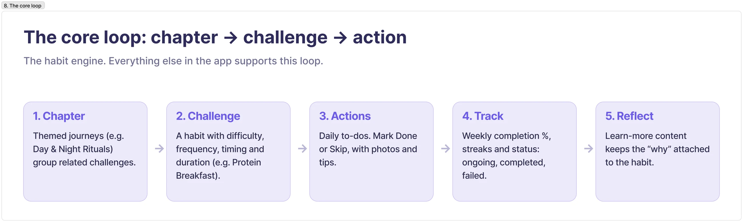
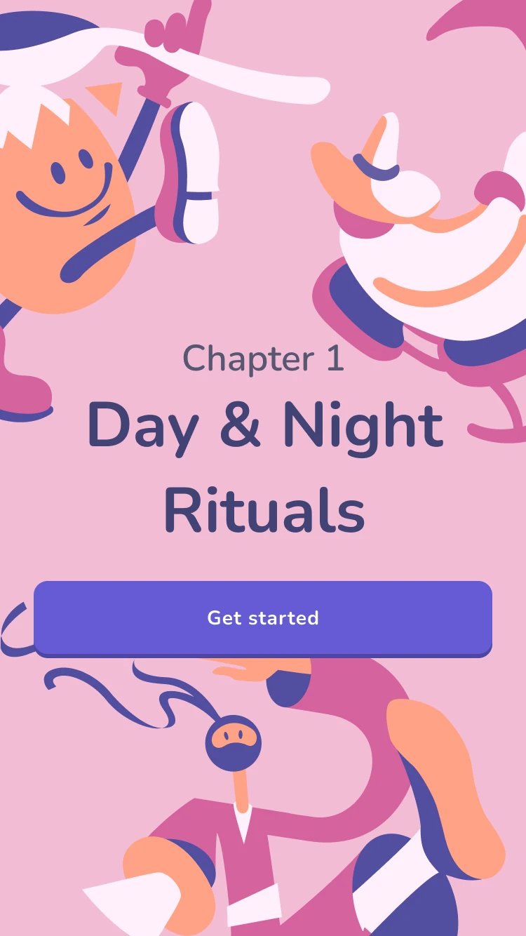
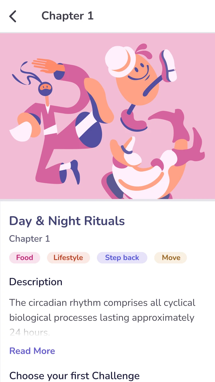
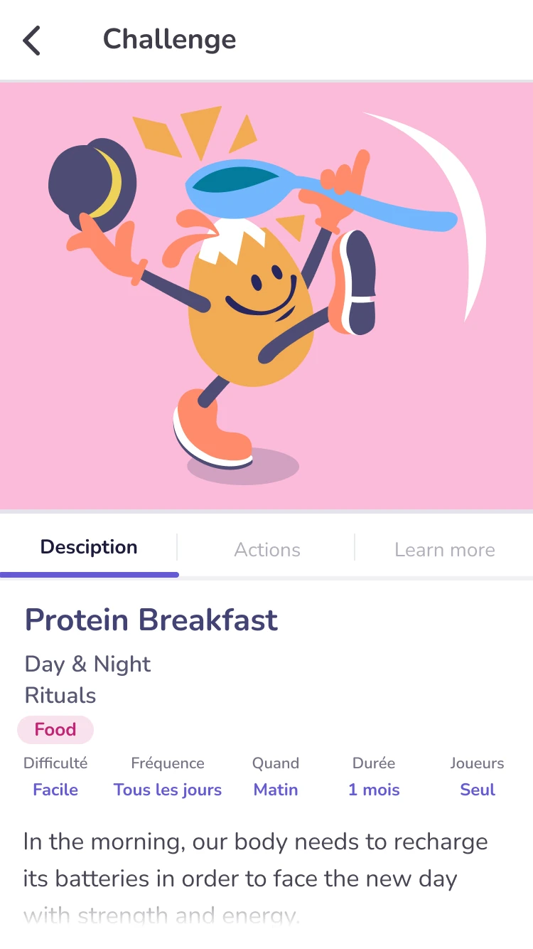
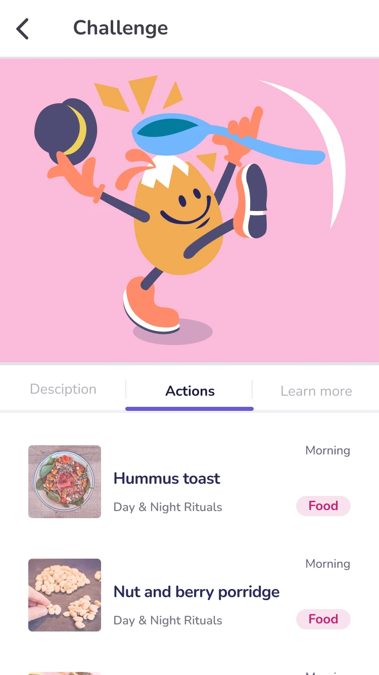
Everything supports one habit engine: Chapters group themed Challenges (each with difficulty, frequency and timing); daily Actions are simple Done/Skip to-dos; progress is tracked with completion, streaks and status; and learn-more content keeps the “why” attached to each habit.
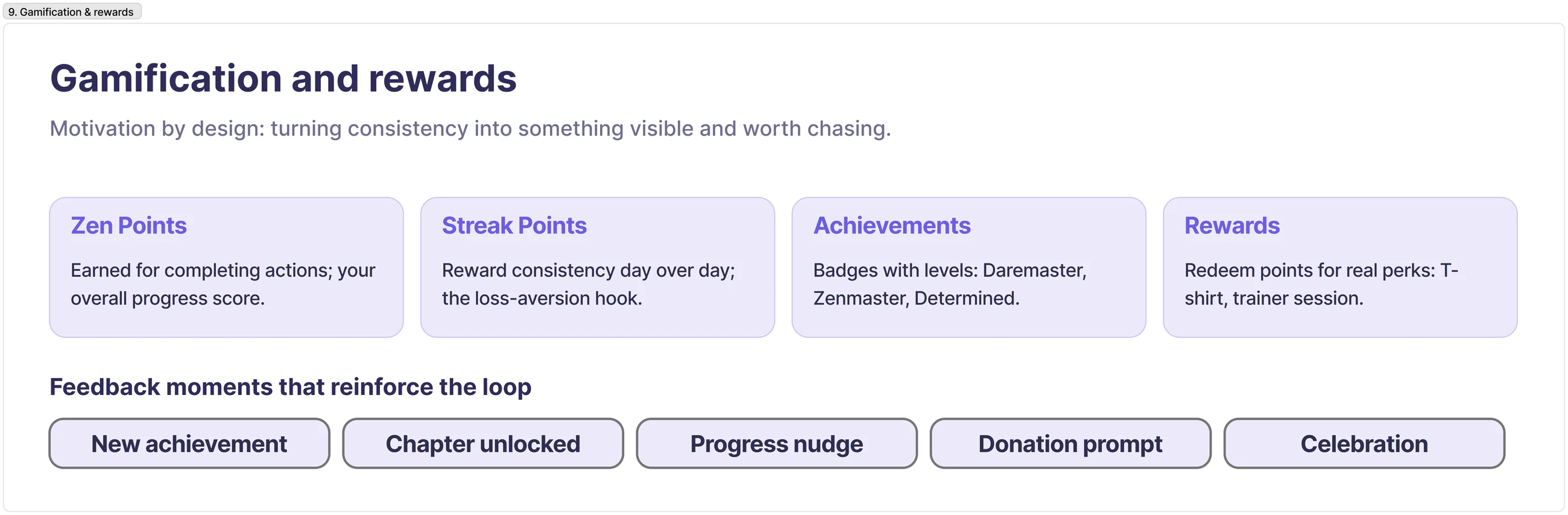
Gamification stays tied to real behaviour: Zen Points and streaks reward genuine daily actions, levelled achievements mark real milestones, and redeemable rewards keep motivation visible. The game layer serves the habit, not the other way round.
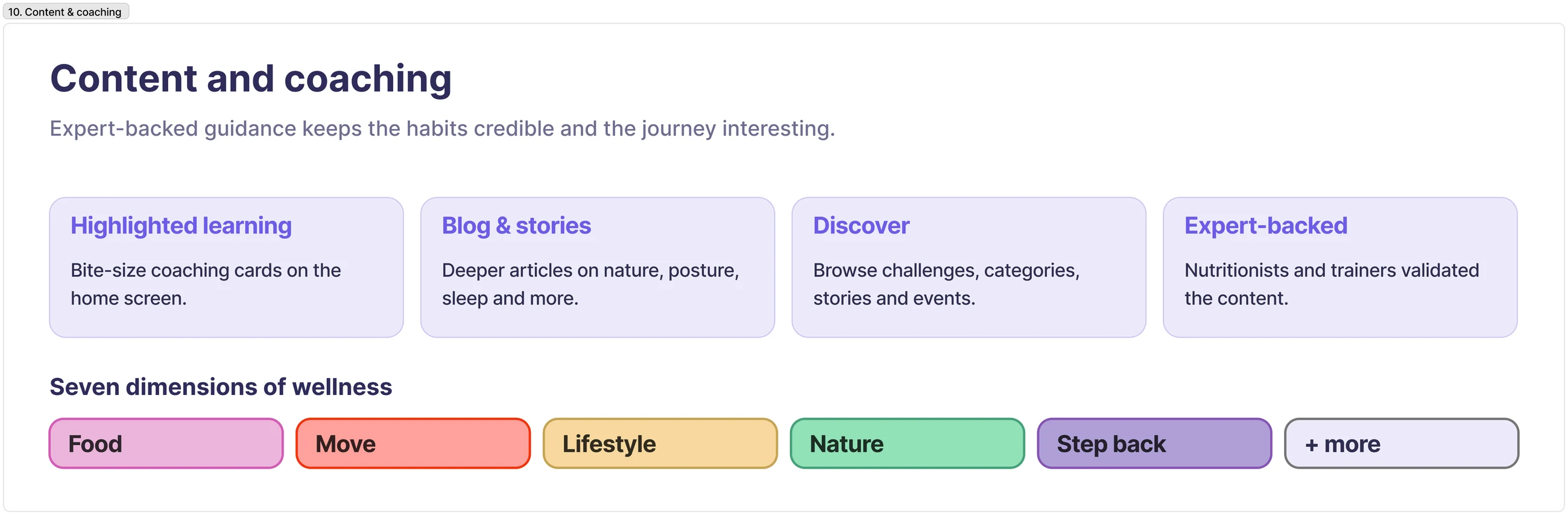
Expert-backed guidance is what keeps the habits credible and the journey worth returning to. Nutritionists and trainers validated the challenges, and learn-more content sits beside each action so the “why” travels with the habit rather than living in a separate library.
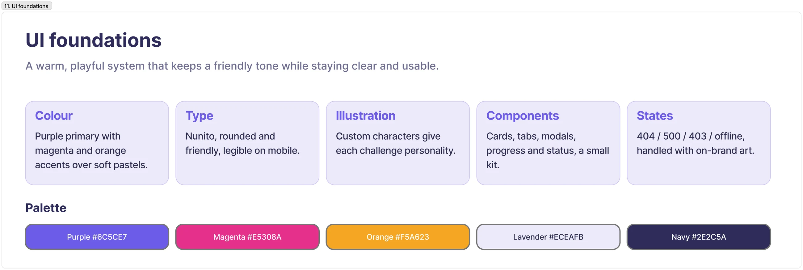
A warm, colourful system that stays friendly without losing clarity: purple with magenta and orange accents, Nunito, custom illustration, and full error and empty states.
Built as a single PWA in Ionic/StencilJS and shipped to a live beta on both iOS and Android from one codebase.
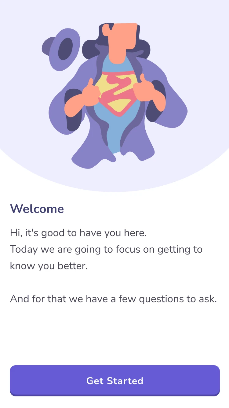
Welcome
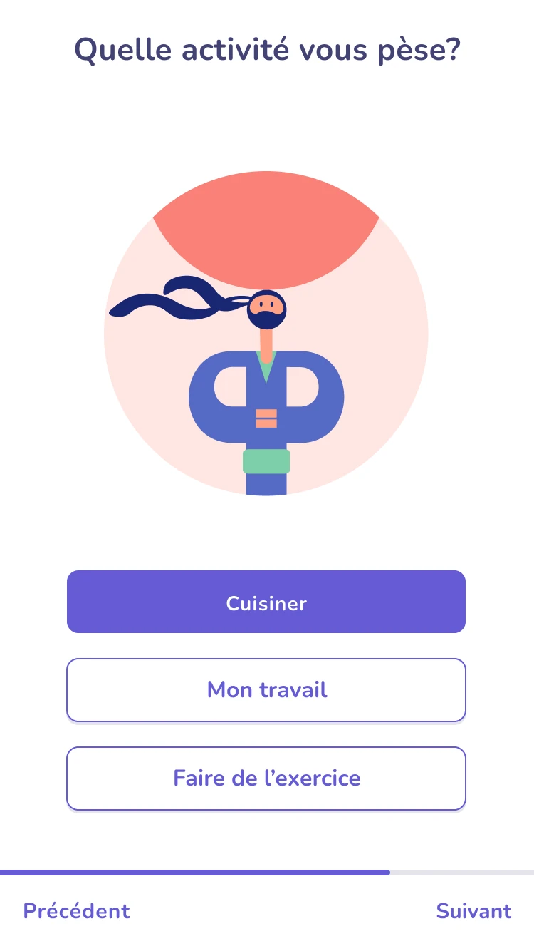
Personalising
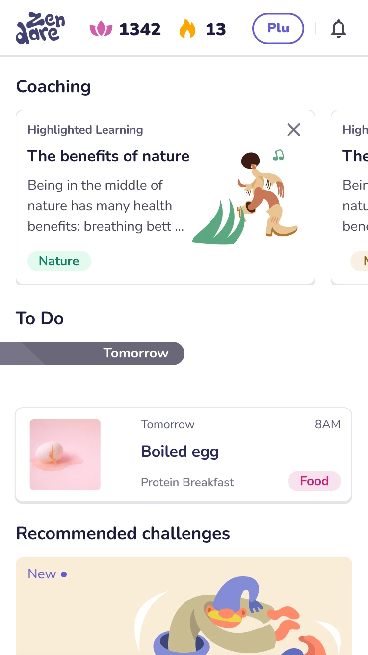
Home & streaks
Chapter
Challenges
Challenge
Daily actions
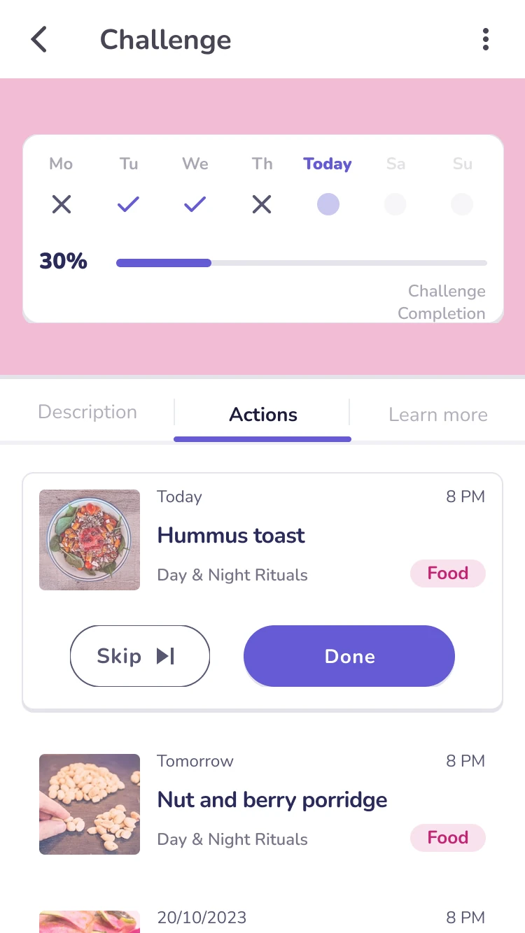
Tracking
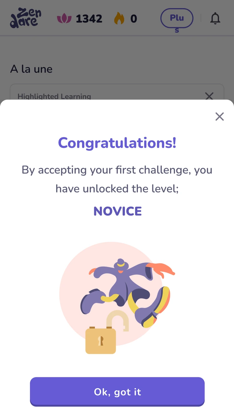
Achievement
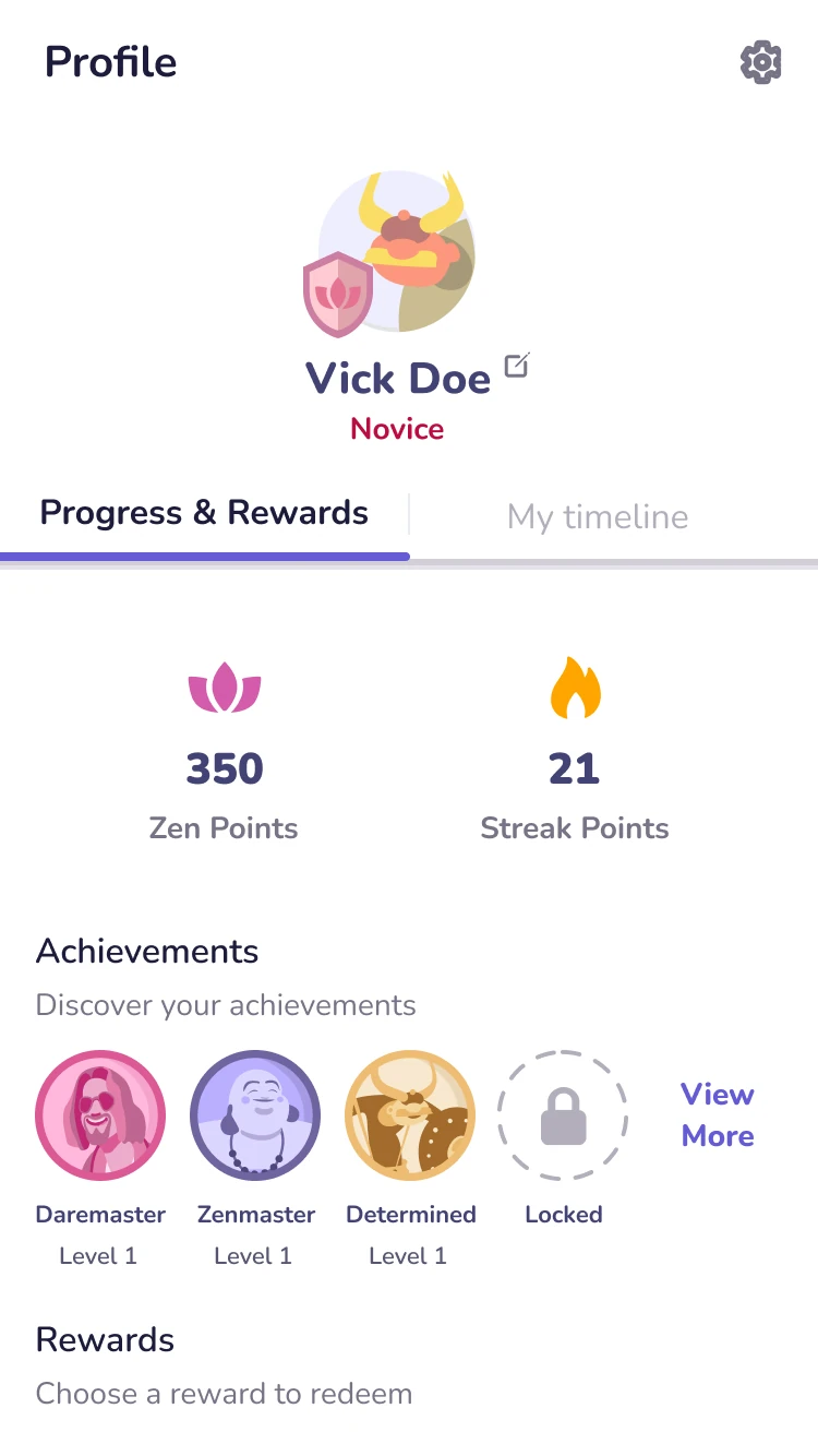
Progress & rewards
The live beta, screen by screen: welcome, personalisation, chapters, challenges, daily actions, tracking, achievements and rewards.
Validated, then defunded. Still a complete zero-to-shipped story.
Seven wellness dimensions, 100+ expert-backed challenges, and a beta live on both stores from one PWA build. The concept and loop were validated with real users before COVID froze the funding and the project paused. It still shows I can take a product from research all the way to shipped.
Like what you see?